To install, in the terminal enter:
pip install statsmodels
import statsmodels as sm

Python Libraries
Most commonly used for statistical analysis.
To install, in the terminal enter:
pip install statsmodels
import statsmodels as sm
What is VIF? According to investopedia it is a measure of the amount of multicollinearity in regression analysis. This means that it tests if there is a correlation between any of your independent variables in your analysis.
Why check VIF? When doing regression multicollinearity must be understood and dealt with in order to be able to have a statistically significant regression model. The actual predictive power of a model is not affected by multicollinearity but the regression coefficients would be meaning that your read on how much each independent variable affects the outcome would be affected.
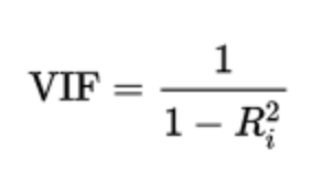
How is it calculated? VIF is calculated by taking a predictor (independent variable) and doing a regression against every other predictor that you are using in your model. This would give you the R-squared value for each pair of predictor variables then that would be plugged into the VIF formula:
How to read VIF results? General rule of thumb
How do we program VIF calculation? There are two methods that can be done: creating a function that calculates it or using statsmodels function variance_inflation_factor.
Method 1:
First we define the function with inputs of the dataframe and the features we want to analyze:
def calculate_vif(df, features):
vif, tolerance = {}, {}
for feature in features:
X = [f for f in features if f != feature]
X, y = df[X], df[feature]
r2 = LinearRegression().fit(X, y).score(X, y)
tolerance[feature] = 1 - r2
vif[feature] = 1/(tolerance[feature])
return pd.DataFrame({'VIF': vif, 'Tolerance': tolerance})
Method 2
After we import our function:
from statsmodels.stats.outliers_influence import variance_inflation_factor
vif_df = pd.DataFrame()
removed_df = df.drop(['Attrition_encoded'], axis=1)
vif_df["feature"] = removed_df.columns
vif_df["VIF"] = [variance_inflation_factor(removed_df.values, i) for i in range(len(removed_df.columns))]
print(vif_df)
Logistic regression can be used to estimate the relationship between a categorical outcome (dependent variable) and independent variables and it can also be used to estimate the probabilty of an event occurring. The value outcome will be between 0 and 1.
There are also three different kinds of logistic regressions: binary, multinomial, and ordinal, which you can read more about on the IBM webite.
Running a logistic regression is very easy using statsmodels. First, import the regression library:
import statsmodels.api as sd
sd_model0 = sd.Logit(y0_train, X0_train).fit()
sd_model0.summary()
Most commonly used for statistical analysis.
To install, in the terminal enter:
pip install scipy
from scipy import stats
Entropy is the measure of disorder within the data. The lower the entropy, the more defined the data is. This example shows how entropy would look visually in a dataset:
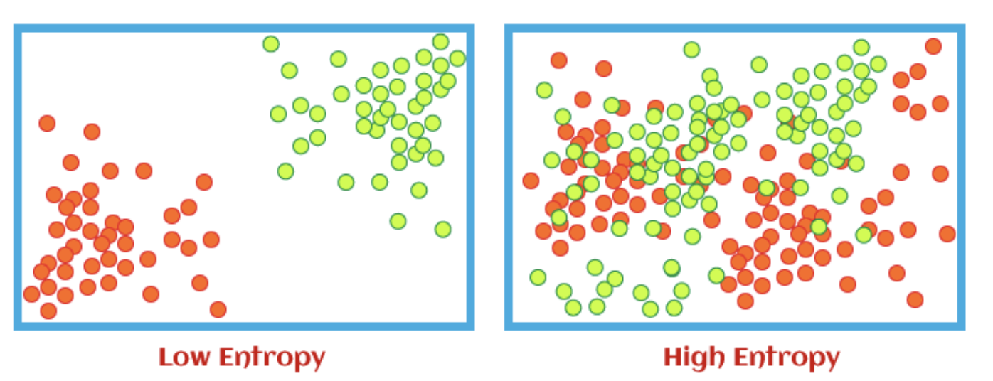
We use entropy to help us calculate information gain. Information gain just tells us how much information has been gained at each sublevel in relation to the previous level. This is useful for decision trees.
Writing a entropy calculation is super easy using SciPy stats package. First, we import the function entropy:
from scipy.stats import entropy
entropy(df.iloc[:, 5], base=2)
According to ScienceDirect: the Shapiro-Wilk test can be used to decide whether or not a sample fits a normal distribution, and it is commonly used for small samples.
The test is a hypothesis test meaning that there is a null hypothesis and an alternative hypothesis. In this case the null hypothesis states that the samples comes from a normal distribution, the alternate hypothesis states the sample does not come from a normal distribution. If the p-value is small enough (depending on the confidence interval chosen: 95% means p <= 0.05) then we reject the null hypothesis, meaning that the sample does NOT come from a normal distribution. However, if we have a large p-value (e.g. p > 0.05), then we fail to reject the null hypothesis meaning our sample does come from a normal distribution.
All that is needed for the Shapiro-Wilk test is the shapiro function from the stats library of SciPy:
from scipy import stats
print(stats.shapiro(df['column']))
A Box Cox transformation transforms non-normal dependent variables into a normal distribution.
You can find more details on Box Cox transformation here.
For the Box Cox transformation we just need the boxcox function from the stats library of SciPy:
from scipy import stats
variable_transformed = stats.boxcox(df['variable'])[0]
Most commonly used for statistical analysis to deal with imbalanced datasets.
To install, in the terminal enter:
pip install imblearn
import imblearn
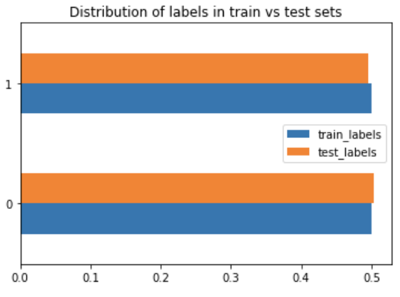
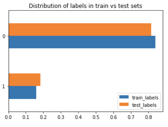
While creating a decision tree model I noticed that the output (feature I wanted to predict) was imbalanced:
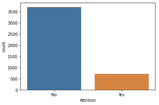
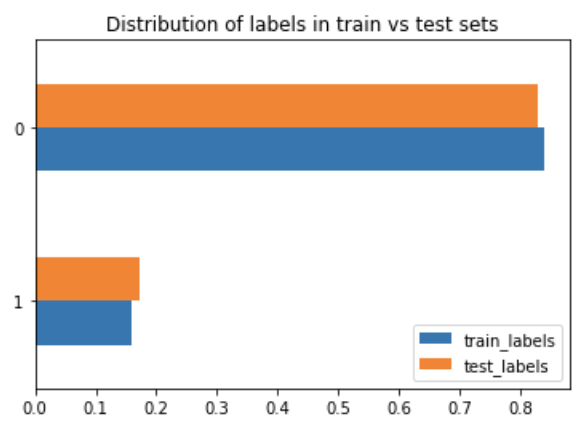
There are many different ways to deal with an imbalanced dataset. I found this great article that listed some methods:
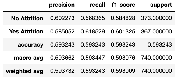
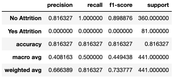
I tried four of the ones listed just to see how they would compare to each other.
RandomOverSampler: as the name suggests, the data is randomly sampled to make up the minority. What this means is: "Object to over-sample the minority class(es) by picking samples at random with replacement."
from imblearn.over_sampling import RandomOverSampler
First we get our data ready to train by removing the encoded predictions and store in a separate df:
y1 = new_df['Attrition_encoded']
X1 = new_df.drop('Attrition_encoded', axis=1)
ros = RandomOverSampler()
variablex_ros, y_ros = ros.fit_resample(X1, y1)
X1_train, X1_test, y1_train, y1_test = train_test_split(variablex_ros, y_ros, test_size=0.1)#, random_state=0)
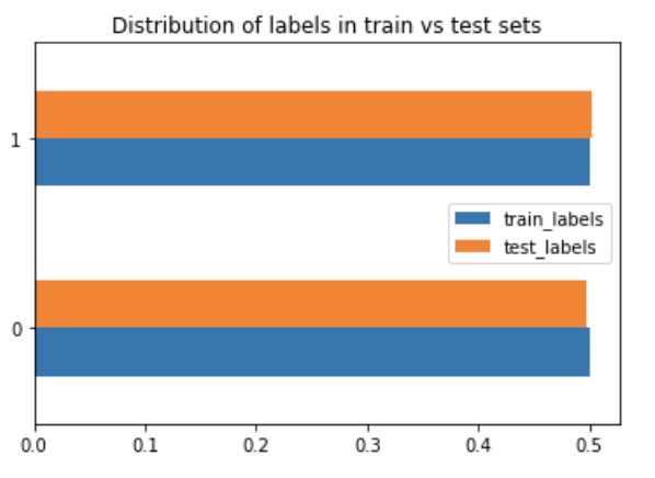
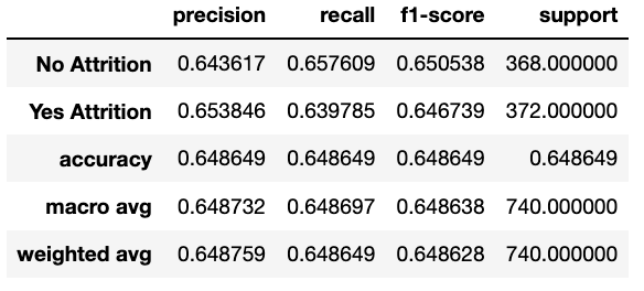
RandomUnderSampler: as the name suggests, the data is randomly sampled to get rid of some majority. What this means is: "Under-sample the majority class(es) by randomly picking samples with or without replacement."
from imblearn.under_sampling import RandomUnderSampler
First we get our data ready to train by removing the encoded predictions and store in a separate df:
y1 = new_df['Attrition_encoded']
X1 = new_df.drop('Attrition_encoded', axis=1)
rus = RandomUnderSampler()
variableX_rus, y_rus = rus.fit_resample(X2, y2)
X1_train, X1_test, y1_train, y1_test = train_test_split(variablex_rus, y_rus, test_size=0.1)#, random_state=0)
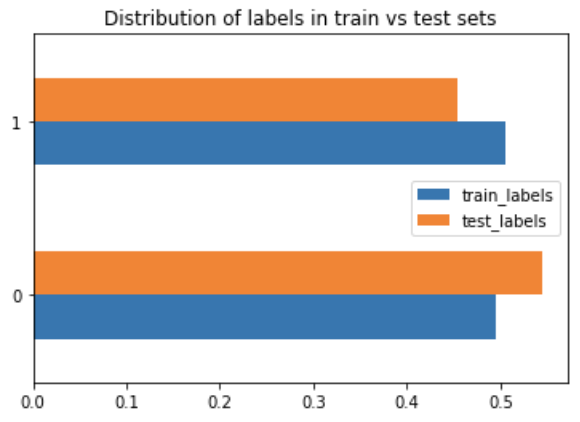
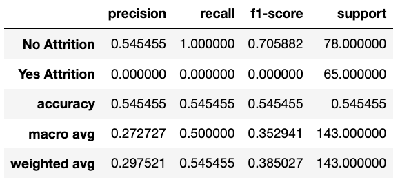
SMOTE (aka Synthetic Minority Over-sampling Technique): uses statistical techniques to increase the number of minority data points. It doesn't just copy the data given, but rather uses nearest neighbours to generate new data points.
from imblearn.over_sampling import SMOTE
First we get our data ready to train by removing the encoded predictions and store in a separate df:
y1 = new_df['Attrition_encoded']
X1 = new_df.drop('Attrition_encoded', axis=1)
smote = SMOTE(k_neighbors=5)
x_smote, y_smote = smote.fit_resample(X3, y3)
X3_train, X3_test, y3_train, y3_test = train_test_split(x_smote, y_smote, test_size=0.1)#, random_state=0)
TomekLinks: is a method of under-sampling developed by Tomek. It removes samples from the majority class by looking at nearest neighbours and removing the points from the majority that are located closest to the minority points.
from imblearn.under_sampling import TomekLinks
First we get our data ready to train by removing the encoded predictions and store in a separate df:
y1 = new_df['Attrition_encoded']
X1 = new_df.drop('Attrition_encoded', axis=1)
tl = TomekLinks(sampling_strategy='majority')
x_tl, y_tl = tl.fit_resample(X4, y4)
X4_train, X4_test, y4_train, y4_test = train_test_split(x_tl, y_tl, test_size=0.1)#, random_state=0)
Library used for predictive data analysis (machine learning).
To install, in the terminal enter:
pip install scikit-learn
import sklearn
The LabelEncoder from sklearn is a basic encoder that encodes values from 0 to n-1. It should be used for encoding target values as opposed to the input.
Import:
from sklearn.preprocessing import LabelEncoder
A super simple example:
encoder = LabelEncoder()
df['sex_encoded'] = encoder.fit_transform(df['sex'])
df['smoker_encoded'] = encoder.fit_transform(df['smoker'])
df['region_encoded'] = encoder.fit_transform(df['region'])

A simple encoder is useful for some situations but one hot encoding is very popular because it is a lot more useful and expressive. It is used to convert categorical variable into numerical with trying to lose the least amount of information.
For certain categories, they were ordinal (ordered categorical features), so instead of one hot encoding, I used the OrdinalEncoder. This stack overflow thread helped me with using the encoder.
In the example below, I use all three types of encoders that I have talked about so far.
First, we import all 3 encoders:
from sklearn.preprocessing import LabelEncoder
from sklearn.preprocessing import OneHotEncoder
import category_encoders as ce
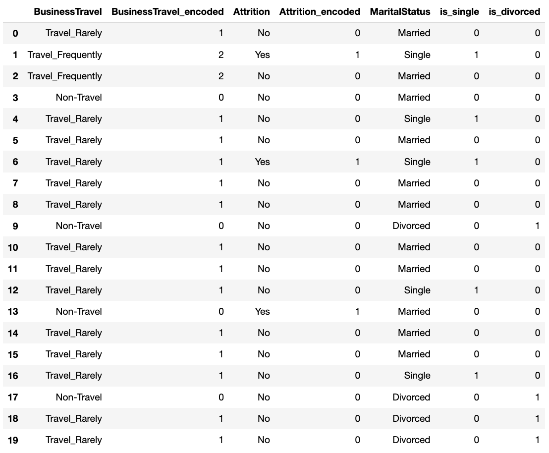
For my business travel, I had the following categories: 'Non-Travel', 'Travel_Rarely', and 'Travel_Frequently'. I first created a dictionary for travel and then used the ordinal encoder to create a new column for my dataframe.
travel_dic = [{'col': 'BusinessTravel', 'mapping': {'Non-Travel': 0,'Travel_Rarely': 1, 'Travel_Frequently': 2 }}]
encoder_ordinal = ce.OrdinalEncoder(mapping = travel_dic, return_df = True)
new_df['BusinessTravel_encoded'] = encoder_ordinal.fit_transform(df['BusinessTravel'])
new_df['Attrition_encoded'] = LabelEncoder().fit_transform(df['Attrition'])
new_df['is_single'] = (df['MaritalStatus'] == 'Single').astype(int)
new_df['is_divorced'] = (df['MaritalStatus'] == 'Divorced').astype(int)
new_df['MaritalStatus_encoded'] = encoder_hot.fit_transform(df['MaritalStatus'])
Using the sk-learn function to split the data is very easy. You must import the library.
from sklearn.model_selection import train_test_split
X = new_df.drop('Attrition_encoded', axis=1)
y = new_df['Attrition_encoded']
X_train, X_test, y_train, y_test = train_test_split(X, y, test_size=0.1, random_state=0)
To create our own function for splitting into train, validate, and test, we must specify which inputs we can have. I chose the automatic values for train_size and val_size, but those can be changed.
def split_data(X, y, train_size=0.7, val_size=0.15):
total_data = X.shape[0]
train_size = int(train_size * total_data) val_size = int(val_size * total_data) test_size = total_data - train_size - val_size
all_indices = np.random.permutation(np.arange(total_data))
train_indices = all_indices[:train_size]
val_indices = all_indices[train_size:train_size + val_size]
test_indices = all_indices[train_size+val_size:]
train_X, train_y = X.iloc[train_indices], y.iloc[train_indices]
val_X, val_y = X.iloc[val_indices], y.iloc[val_indices]
test_X, test_y = X.iloc[test_indices], y.iloc[test_indices]
return {'train': (train_X, train_y),}
'val': (val_X, val_y),
'test': (test_X, test_y)
Import library
from sklearn.linear_model import LinearRegression
Instantiate a linear regression model
linear_model = LinearRegression()
linear_model.fit(X_train, y_train)
To print out the intercept and coefficients for the linear regression model, you can just call on various functions:
print(linear_model.intercept_)
print(linear_model.coef_)
We can also use the .predict() function to give predictions for the outcome based on the model and the inputs given.
y_pred = linear_model.predict(X_test)
Import library
from sklearn.linear_model import LogisticRegression
Instantiate a logistic regression model
logit_model = LogisticRegression()
logit_model.fit(X_train, y_train)
To print out the intercept and coefficients for the linear regression model, you can just call on various functions:
print(logit_model.intercept_)
print(logit_model.coef_)
We can also use the .predict() function to give predictions for the outcome based on the model and the inputs given.
y_pred = logit_model.predict(X_test)
The metrics package from the sklearn library has a lot of useful statistics. First, we must import the metrics package from the sklearn library.
from sklearn import metrics
When doing regressions (or other statistic tests), it can be useful to know the mean error. Mean squared error (MSE) squares all of the differences between the estimated value and the actual value and then takes the average. This method penalizes more wrong answers. In order to make the value useful, it is recommended to take the square root of the MSE (aka RMSE) to have a value in line with the values of your data. Sklearn mean_squared_error takes in the y_true and y_pred and returns the MSE and the RMSE (if squared=False).
Mean absolue value, does something similar thing but instead of squaring it takes the absolute value of the differences and averages it. This means it does not give a significantly greater rating to wrong answers. You would use this method if your data doesn't have a particular desire to penalize larger errors. Sklearn mean_absolute_error takes in the y_true and y_pred and returns the MAE.
R^2 represents how much of the variance in our dependent variable is explained by the independent variable(s). The value is a proportion. Sklearn r2_score takes in the y_true and y_pred and returns the R^2 score.
print("Mean squared error (MSE) =", metrics.mean_squared_error(y_test, y_pred))
print("Root Mean squared error (RMSE) =", metrics.mean_squared_error(y_test, y_pred, squared=False))
print("Mean absolute error (MAE) =", metrics.mean_absolute_error(y_test, y_pred))
print("R^2 =", metrics.r2_score(y_test, y_pred))

Accuracy is the simplest calculation to see the number of correct predictions. The formula is:

We can use sk-learn's accuracy function:
print(metrics.accuracy_score(y_test, y_pred));
Or we can create a function to compute the accuracy of a given model on input data X and label t. This would be useful if you want to change model parameters to find the optimization of various parameters.
def get_acc(model, X, t):y_pred = model.predict(X)
y_test = t
acc = (y_pred == y_test).mean()
return acc
However, accuracy can be misleading, especially if we are working with an imbalanced dataset. We can also calculate precision, recall, and F1 score using .classification_report() function.


print(metrics.classification_report(y_test, y_pred, target_names=['non-smoker', 'smoker']));

We can use the sk-learn confusion_matrix() to calculate the accuracy values within each section of the confusion matrix. Then use the sk-learn's .ConfusionMatrixDisplay() function to display the confusion matrix.
cm = metrics.confusion_matrix(y_test, y_pred, labels=logit_model.classes_)
disp = metrics.ConfusionMatrixDisplay(confusion_matrix=cm, display_labels=logit_model.classes_)
disp.plot(cmap='Blues')
plt.show();
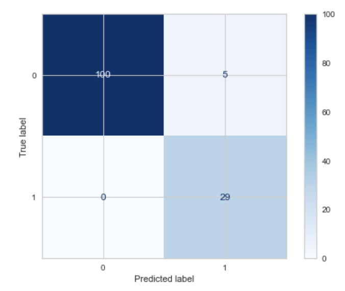
How to interpret the confusion matrix:
To use sk-learn decision tree functionalities, you must import:
from sklearn import tree
Fitting a decision tree to your data is as easy as fitting it to a linear or logistic regression, by using the DecisionTreeClassifier() function from sklearn. And we can also predict our outcome based on the decision tree model created.
dt_model = DecisionTreeClassifier(criterion = 'gini', max_depth = 18)
dt_model = dt_model.fit(model['train'][0], model['train'][1])
y_pred = dt_model.predict(model['test'][0])
We can also use the .plot_tree() function to display the tree. The plot_tree returns annotations for the plot, I found this source that returned the value to _ to not show them in the notebook.
fig = plt.figure(figsize=(30,5))
_ = tree.plot_tree(dt_model, filled=True, feature_names = X.columns, max_depth = 2, class_names=['No Attrition', 'Yes Attrition'])

It may be useful to create a function that returns the accuracy of the validation and training set, along with the actual model.
First, we create a function that takes the input of the depth we want the tree to go to, the data we will be using, and the target criterion.
def select_model(depths, data, criterion):
out = {}
for d in depths:out[d] = {}
tree = DecisionTreeClassifier(criterion = criterion, max_depth = d)
tree = tree.fit(data['train'][0], data['train'][1])
out[d]['val'] = get_acc(tree, *data['val'])return out
out[d]['train'] = get_acc(tree, *data['train'])
out[d]['model'] = tree
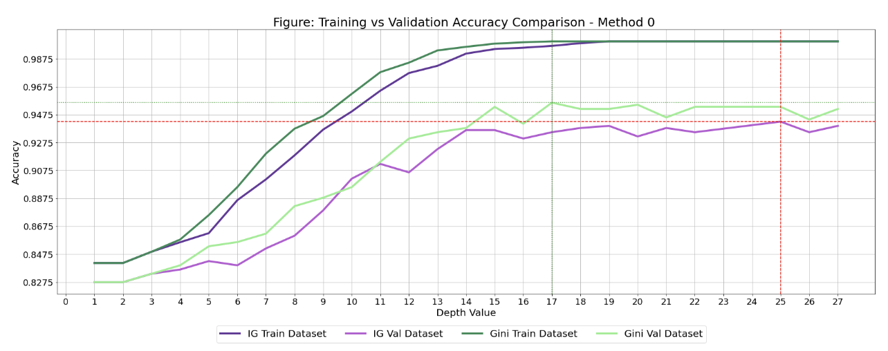
There are two parts to my method of optimizing certain parameters of a decision tree (criterion and max_depth): first creating a list of accuracies while changin parameters, and the second is creating a graph to visualize these accuracies.
I could have gotten my function to go through all the listed depths up to a max, but I wanted to save computation power, so I wrote a list:
depths = [1, 2, 3, 4, 5, 6, 7, 8, 9, 10, 11, 12, 13, 14, 15, 16, 17, 18, 19, 20, 21, 22, 25, 26, 27]
Then I broke up the calculations into Entropy section and Gini section, for the two different criterions.
For the Entropy section: I wanted to train the model with the entropy criterion and varying depths. I used the select_model() function that we created.
res_entropy = select_model(depths, model, "entropy")
best_d_entropy = None
best_acc_entropy = 0
for d in res_entropy:val_acc = res_entropy[d]['val']
if val_acc > best_acc_entropy:best_d_entropy = d
best_acc_entropy = val_acc
I did the same steps with the Gini criterion:
res_gini = select_model(depths, model,"gini")
best_d_gini = None
best_acc_gini = 0
for d in res_gini:val_acc = res_gini[d]['val']
if val_acc > best_acc_gini:best_d_gini = d
best_acc_gini = val_acc
I could have printed the best accuracy for both criterion, but I find that just getting the best value doesn't tell the whole story. There may be cases where you don't want the best accuracy from the validation set (overfitting/underfitting), so this is why I wanted to plot all the accuracies.
Just like before, I created list of accuracy values for the validation and training set using entropy for varying depths.
entropy_val = []
entropy_train = []
depth_val = []
for d in res_entropy:entropy_val.append(res_entropy[d]['val'])
entropy_train.append(res_entropy[d]['train'])
depth_val.append(d)
gini_val = []
gini_train = []
for d in res_gini:gini_val.append(res_gini[d]['val'])
gini_train.append(res_gini[d]['train'])
minimum_acc = min(min(gini_train), min(gini_val), min(entropy_train), min(entropy_val))
maximum_acc = max(max(gini_train), max(gini_val), max(entropy_train), max(entropy_val))
entropy_max_x = depth_val[np.argmax(entropy_val)]
gini_max_x = depth_val[np.argmax(gini_val)]
plt.figure(figsize=(30, 10))
plt.plot(depth_val, entropy_train, label = "IG Train Dataset", color="rebeccapurple", linewidth=4)
plt.plot(depth_val, entropy_val, label = "IG Val Dataset", color="mediumorchid", linewidth=4)
plt.plot(depth_val, gini_train, label = "Gini Train Dataset", color="seagreen", linewidth=4)
plt.plot(depth_val, gini_val, label = "Gini Val Dataset", color="lightgreen", linewidth=4)
plt.title('Figure: Training vs Validation Accuracy Comparison - Method 0 ', fontsize=25)
plt.xlabel('Depth Value', fontsize=20)
plt.ylabel('Accuracy', fontsize=20)
plt.legend(bbox_to_anchor=(0.8, -0.1), ncol=4, fontsize=20)
plt.xticks(np.arange(0, max(depth_val)+1, 1), fontsize=18)
plt.yticks(np.arange(minimum_acc, maximum_acc, 0.02), fontsize=18)
plt.axhline(y = max(entropy_val), color='r', linestyle='dashed')
plt.axvline(x=entropy_max_x, color='r', linestyle='dashed')
plt.axhline(y = max(gini_val), color='g', linestyle='dotted')
plt.axvline(x=gini_max_x, color='g', linestyle='dotted')
plt.grid()
plt.show;
Here is how the graph would look:
To use sk-learn KNeighborsClassifier, you must import:
from sklearn.neighbors import KNeighborsClassifier
KNN classifiers are based on the idea that datapoints close together should be classified the same way, training points that are closer together would be more important in determining the outcome. This graph below shows how close our training examples are to the validation set.
We want to create a list to store the distances calculated between the validation set and the training set.
distances = []
for x_val in model['val'][0]:distance = np.sum((x_val[np.newaxis, ...] - model['train'][0]) ** 2, axis=1)
distances.append(distance)
distances = np.array(distances)
plt.figure(figsize=(40, 10))
plt.imshow(distances)
plt.colorbar()
plt.xlabel('Training examples id', fontsize=30)
plt.ylabel('Val examples id', fontsize=30)
plt.xticks(np.arange(0, model0['train'][0].shape[0], 100), fontsize=15)
plt.yticks(np.arange(0, model0['val'][0].shape[0], 50), fontsize=15)
plt.show;
Final product would be:

Just like all our other models, we must fit our kNN model to our data.
We have to specify how many nearest neighbours we want to look at. This is a parameter that is optimized, so we will look closer at that in the next tab. For this example, I just selected 6 nearest neighbours.
neigh = KNeighborsClassifier(n_neighbors=6)
neigh.fit(*model['train'])
y0_pred_test = neigh.predict(model0['test'][0])
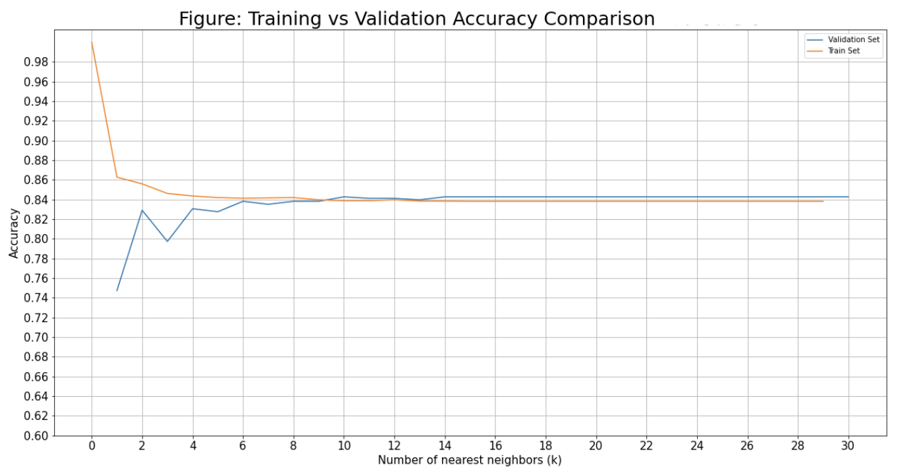
Same as with the decision tree, we want to first create a list of accuracies and then plot them to find the best parameter(s) - in this case I am looking at number of nearest neighbours.
Create a list for both the training and validation set accuracy.
train_value = []
val_accs = []
k_max = 31
for k in range(1, k_max):neigh = KNeighborsClassifier(n_neighbors=k)
neigh.fit(model['train'][0], model['train'][1])
y_pred = neigh.predict(model['val'][0])
y_train_pred = neigh.predict(model['train'][0])
acc = (y_pred == model['val'][1]).mean()
val_accs.append(acc)
train_value.append((y_train_pred == model['train'][1]).mean())
Now that we have our lists of accuracies, we can plot them.
plt.figure(figsize=(20, 10))
plt.plot(list(range(1, k_max)), val_accs, train_value)
plt.title('Figure: Training vs Validation Accuracy Comparison', fontsize=25)
plt.xlabel('Number of nearest neighbors (k)', fontsize=15)
plt.ylabel('Accuracy', fontsize=15)
plt.xticks(np.arange(0, k_max, 2), fontsize=15)
plt.yticks(np.arange(0.6, 1, 0.02), fontsize=15)
plt.grid()
plt.legend(['Validation Set', 'Train Set'])
plt.show;
Language processing to parse through words and sentences.
To install, in the terminal enter:
pip install --user -U nltk
import nltk
First we have to import the following package:
import nltk
Since we want to remove stopwords, we must also import the stopwords (and download the library of words):
from nltk.corpus import stopwords
nltk.download('stopwords')
We can also include punkt to make longer texts into sentences (word collections). I did not use this for removing stop words as what I was parsing was very small, but I found it useful to know!
nltk.download('punkt')
Finally, in order to parse through words and be able to compare them, we must import the word_tokenize package:
from nltk.tokenize import word_tokenize
Now that we have imported our libraries, we can move on to the actually removing stopwords.
There are two different methods I found that you can use to remove stopwords: method 1 or method 2. I will be showing method 1.
First, I made a list for the phrases I wanted to parse through and remove stopwords (for the Costco products):
no_sw_costco = []
for costco_item in stripped_rcs_costco['lowercase_Costco']:
text_tokens_costco = word_tokenize(costco_item)
tokens_without_sw_costco = [word for word in text_tokens_costco if not word in stopwords.words()]
single_string_no_sw_costco = ""
for word in tokens_without_sw_costco:single_string_no_sw_costco = single_string_no_sw_costco + " " + word
no_sw_costco.append(single_string_no_sw_costco)
stripped_rcs_costco['no_sw_Costco'] = no_sw_costco
Here we will look at the percentage of similarities in sentences for the same costco vs rcs item. I used this resource to guide me in how to compare sentences.
To compare sentences you can use the natural language processing module called spaCy. Here is a great resources for all about spaCy. Since I needed to use spaCy I had to install it, but it was very easy to do:
pip install spacy
import spacy
What is the difference between NLTK and spaCy? Basically, NLTK the input must be a string and the output will be a list of strings, whereas spaCy allows functions to return objects.
We have to first load the language we want to use (I chose en_core_web_lg)
nlp = spacy.load("en_core_web_lg")
length = len(stripped_rcs_costco.index)
lowercase_item_similarity = []
no_sw_item_similarity = []
for i in range(length):
lowercase_item_similarity.append(nlp(stripped_rcs_costco.iloc[i][8]).similarity(nlp(stripped_rcs_costco.iloc[i][9])))
no_sw_item_similarity.append(nlp(stripped_rcs_costco.iloc[i][10]).similarity(nlp(stripped_rcs_costco.iloc[i][11])))
stripped_rcs_costco['lowercase_item_similarity'] = lowercase_item_similarity
stripped_rcs_costco['no_sw_item_similarity'] = no_sw_item_similarity
This library is used for visualizing map data.
To download, in the terminal enter:
pip install folium
import folium
Particularly, for making more complex markers on your map plugins should be imported as well:
from folium import plugins
Folium has a section on how to "quickstart" a simple map, which I used to get me started.
First, we must name the map and give the latitude and longitude coordinates. I wanted to be centered around a set of data points, so I used .mean() of the LATITUDE column and LONGITUDE column from the top10_mean_df:
top10_mean_map = folium.Map(location=[top10_mean_df.LATITUDE.mean(),top10_mean_df.LONGITUDE.mean()])
On top of specifying the location, we can also change within the .map():
top10_mean_map = folium.Map(location=[top10_mean_df.LATITUDE.mean(),
top10_mean_df.LONGITUDE.mean()],
tiles = 'CartoDB Positron',
zoom_start=12,
control_scale=True)
Next, we want to go through our database and add each intersection’s location to the map:
for index, location_info in top10_mean_df.iterrows():folium.Marker([location_info['LATITUDE'], location_info['LONGITUDE']]).add_to(top10_mean_map)
There are things that we can change with our markers, one of which is to write message for any marker: popup (must click on marker) or tooltip (shows up when hovering over marker).
Placing a variable popup_message with the message helps make more complex messages. You can use .format() to insert multiple variables into a string.
for index, location_info in top10_mean_df.iterrows():popup_message = '{}) {}'.format(location_info['Ranking'], location_info['INTERSECTION'])
folium.Marker([location_info['LATITUDE'], location_info['LONGITUDE']],tooltip= popup_message).add_to(top10_mean_map)
There is so much more that can be done with markers.
Basic icon uses .Icon() to create a marker with a blue background and an information icon.
folium.Marker([location_info['LATITUDE'], location_info['LONGITUDE']],
tooltip= popup_message,
icon=folium.Icon()).add_to(top10_mean_map)
Font Awesome has a huge variety of icons that can be used, however, that large list on Font Awesome doesn’t always work, but this list does.
icon=folium.Icon(color = 'gray',icon='circle', # from font awesome
icon_color = 'red',
prefix='fa') # specifies that it is from font awesome - there are other ways to get icons too
Circle icon with number inside, you would need to use Folium’s plugins module:
icon = plugins.BeautifyIcon(number=location_info['Ranking'],border_color = 'dodgerblue',
border_width = 1,
text_color = 'dodgerblue',
inner_icon_style = 'margin-top:1px;')
For creating a heat map we must use Folium’s Plugins module. The plugins module has .HeatMap() which takes the locational data and puts it into a heatmap. It is important that your dataframe only has the data needed: latitude and longitude along with the data you want the heat map to be based off of.
plugins.HeatMap(intersection).add_to(intersection_heatmap)
There are many ways to embed files into html, however, I found an article which showed me iframe. I found that it worked best for putting the Folium interactive maps (with .html file type) onto my website.
< iframe src="images/top10_mean_map.html" width="450" height="300">< /iframe>
Most commonly used to visualize data - can be used in conjunction with matplotlib.
To install, in the terminal enter:
pip install seaborn
import seaborn as sb
When importing Seaborn a lot of people import it as sns as opposed to sb. I was very curious about the reasoning for this and I found this explanation: it started as a joke after a character on The West Wing show whose name is Samuel Norman Seaborn (sns). For myself, I chose to go back to importing it as sb. Seaborn works closely with matplotlib, so I always import both when working with visualizations:
import seaborn as sb
import matplotlib.pyplot as plt
Here is documentation for the histogram plot.
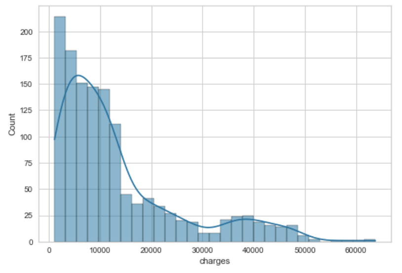
The histogram plot is very useful when showing the distribution of variables (quantitative variables). It is sorted by discrete bins and the variables are counted by which bin the belong to.
The important parameters that I like to use most often are:
Here is a sample code with just the parameter of the a dataframe column and a line to show a smooth distribution:
sns.histplot(df['column'], kde=True)
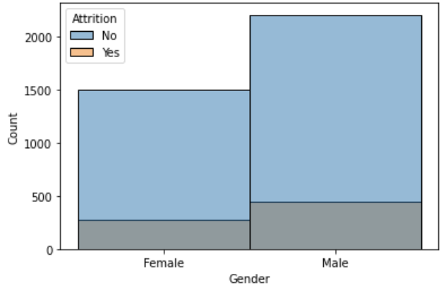
sns.histplot(x='Gender', hue='Attrition', data=df);
Here is documentation for the count plot.
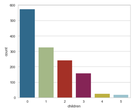
The count plot is similar to the histogram, but it is used for showing the distribution of categorical variables.
Most of the parameters are the same as the histogram, but there are differences. So here are my most frequently used ones:
An example of a plain count plot without changing any features would be:
sns.countplot(x=df['children']);
Here is documentation for the bar plot.
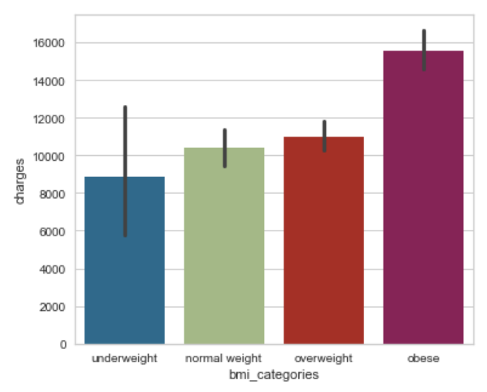
The bar plot shows the estimate of central tendency (e.g. mean, median, mode) for each bar. It can also show the error bars using a confidence interval.
The important parameters that I like to use (aside from data, x, y, hue, order) most often are:
Here is an example where we specify both the x and the y axis, along the order of the axis. Automatically, it has the estimator set to mean and error bar to confidence interval of 95%.
sns.barplot(x='bmi_categories', y='charges', data=df, order=['underweight', 'normal weight', 'overweight', 'obese']);
Here is documentation for the histogram plot.
The line plot is very useful when showing the relationship between variables.
sns.lineplot(x='age', y='charges', data=df, ax=ax0);
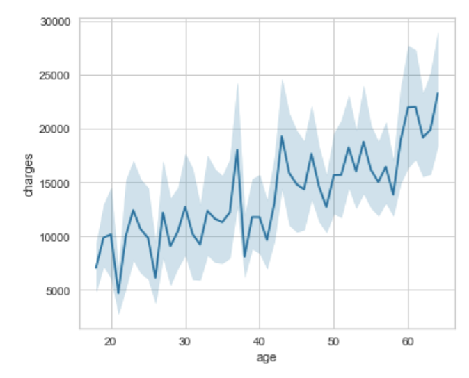
You must define your variables for your plot. This would involve defining your fig for your whole plot, then the subplots you want to populate (I have labeled them ax and which number it is: ax0, ax1, ax2). Then using matplotlib's function /subplots() we can specify the number of rows, number of columns, and then the figure size. After that you just need to specify the ax= for each of your subplots.
fig, (ax0, ax1, ax2) = plt.subplots(1, 3, figsize=(20,5))
sns.histplot(x=df['age'], kde=True, ax=ax0);
sns.histplot(x=df['bmi'], kde=True, ax=ax1);
sns.countplot(x=df['children'], ax=ax2);

Just like above, you would specify the axes with numbers but you'd group them by rows. Then you just have to change the first parameter of the .subplot() to represent the number of rows you want - this case 2. The rest of the process is the same.
fig, ((ax0, ax1, ax2), (ax3, ax4, ax5)) = plt.subplots(2, 3, figsize=(20,30))
sns.histplot(x='NumCompaniesWorked', hue='Attrition', data=df, ax=ax0, kde=True,discrete=True);
sns.histplot(x='Education', hue='Attrition', data=df, ax=ax1, kde=True,discrete=True);
sns.histplot(x='JobLevel', hue='Attrition', data=df, ax=ax2, kde=True);
sns.histplot(x='PercentSalaryHike', hue='Attrition', data=df, ax=ax3, kde=True);
sns.histplot(x='StockOptionLevel', hue='Attrition', data=df, ax=ax4, kde=True);
sns.histplot(x='TrainingTimesLastYear', hue='Attrition', data=df, ax=ax5, kde=True);
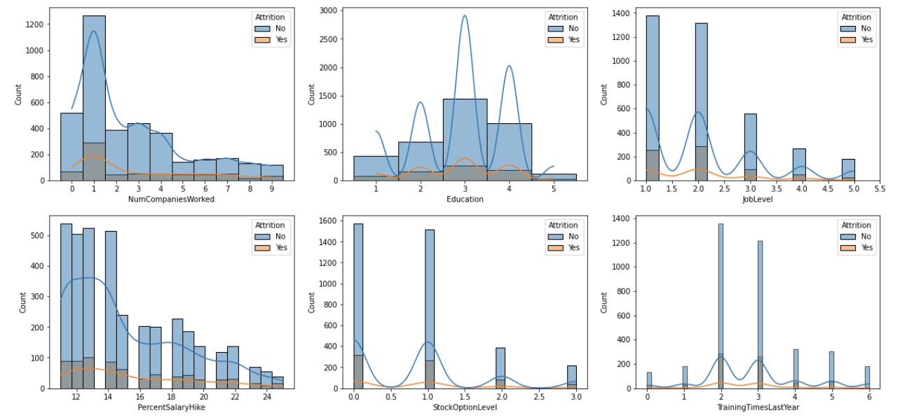
Here is documentation for the heatmap.
The heatmap is very useful when showing the correlation between variables.
The important parameters that I like to use most often are:
Example:
sns.heatmap(df.corr(), cmap='Blues', annot=True);
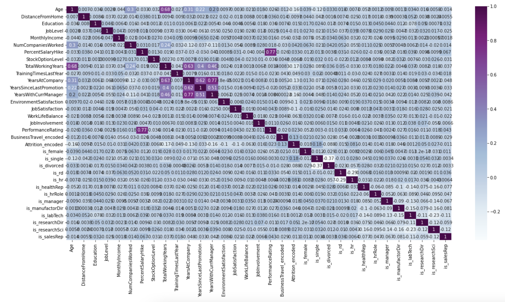
This library is used for visualization of information, usually used in conjuction with NumPy for the mathematical extension.
To download, in the terminal enter:
pip install matplotlib
from matplotlib import pyplot as plt
For any aspect that has colour, I found a good list of colours to pick from. I used it primarily for my graph to do more exciting colours than the normal red/blue that are normally done.
Example: For my one of my bar graphs that had the months on the x-axis, I wanted the bars to be different colours according to the seasons, so:
new_colours = ['darkgrey','darkgrey','darkgrey','lightgreen','lightgreen','lightgreen','gold','gold','gold','darkorange','darkorange','darkorange']
plt.bar(df['Month'], df['Mean'], color=new_colours)
You can get very creative and detailed with your legends and I found Jake VanderPlas did a good job explaining different ways to apply the settings given by matplotlib for legends.
The actual plotting of the graph is easy all you have to do is specify the type and insert the x-axis and y-axis data, very similar to Pandas:
plt.bar(df['x-axis'], df['y-axis'])
plt.show
From here, there are a lot of cool things that can be done:
plt.title('Mean Red Light Violations For All Active Ottawa Locations \n2016-2020', fontsize=35)
plt.xlabel('Month', fontsize=25)
plt.ylabel('Mean Red Light Violations \n(Only Active Locations)', fontsize=25)
plt.xticks(fontsize=15)
plt.yticks(fontsize=15)
plt.figure(figsize=(22,10))
new_colours = ['darkgrey','darkgrey','darkgrey','lightgreen','lightgreen','lightgreen','gold','gold','gold','darkorange','darkorange','darkorange'] plt.bar(monthly_mean_df['Month'], monthly_mean_df['Mean'], color=new_colours)
Don’t forget to use .show() to display the plot:
plt.show
One way to make sure your double bar graph is spaced evenly is to use NumPy's .arange() function, which I go over in the NumPy’s section.
This stackoverflow answer went over a different way to approach the double bar graph spacing, which I did not try yet.
The most important thing for this is to make sure your data is in the correct format. This is where Pandas’ .pivot() function comes in handy.
After my data was in the correct format:
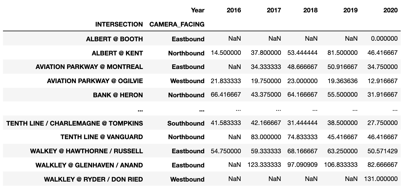
I wanted to try doing a horizontal bar graph, using a combination of Pandas and MatPlotLib. Using .plot() (Pandas), I was able to specify a horizontal bar graph: kind=’barh’, with the width of each bar being .75 and the figure size (width, height):
sort_by_intersection_table.plot(
kind = 'barh',)
width = .75,
figsize = (20,70),
After that I used MatPlotLib to add aspects I needed:
plt.title('Mean Red Light Violations For All Active Ottawa Locations \n2016-2020', fontsize=35)
plt.ylabel('Intersection', fontsize=35)
plt.xlabel('Mean Red Light Violations', fontsize=35)
plt.xticks(fontsize=25)
plt.yticks(fontsize=15, rotation = 5)
New: I added the sizing of the legend to be bigger by using the properties for ’size’:
plt.legend(prop={'size':35})
And you get:
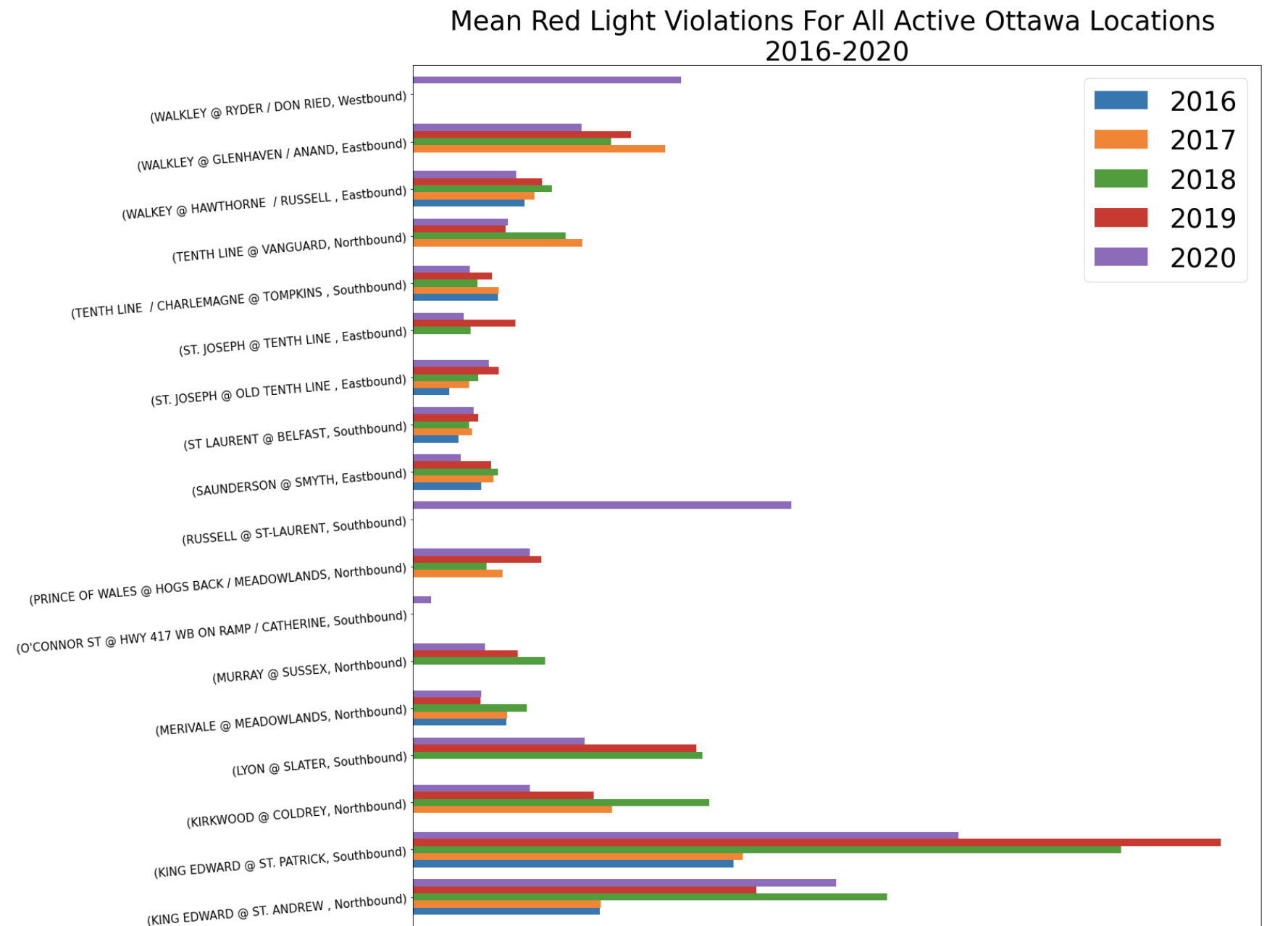
So far I have only created a basic scatter plot using MatPlotLib. Everything is the same as the bar graph except instead of plt.bar() I used plt.scatter():
plt.figure(figsize=(10,10)) plt.scatter(complete_df['Calculated_Highest_Monthly_Value'], complete_df['Mean_Active_Months'])
plt.title('Highest Monthly Total vs Monthly Mean \n for Ottawa Red Light Violations \n 2016-2020', fontsize=30)
plt.xlabel('Highest Monthly Total', fontsize=25)
plt.ylabel('Monthly Mean', fontsize=25)
plt.xticks(fontsize=20)
plt.yticks(fontsize=20)
plt.show()

Error bars are 2x standard error. So the first thing that must be done is calculate standard error - see Pandas section on calculating.
In order to plot the vertical error bars, you must specify the values within the plt.graphtype(). I wanted to have programming to be a bit more organized, so I listed the standard error bars as its own variable and then used that variable within the function (for this example I am using a bar graph):
error = 2*df['StandardError']
plt.bar(df['Month'], df['Mean'], yerr= error)
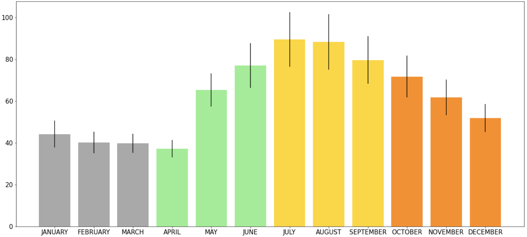
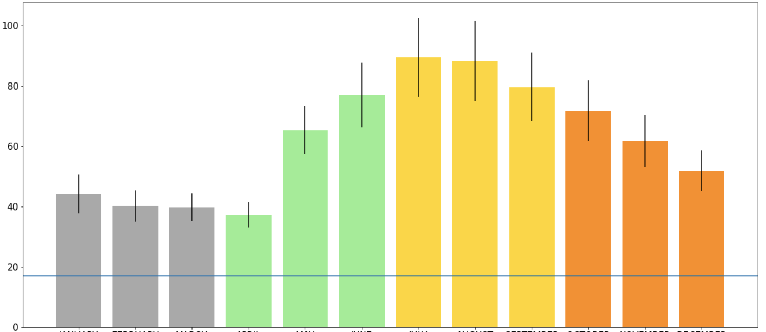
If you want to show a specific value on the y-axis that is useful for the whole graph, it is useful to use .axhline(). On a bar graph that had information on it already I wanted to draw a line at y=17:
plt.axhline(y=17)
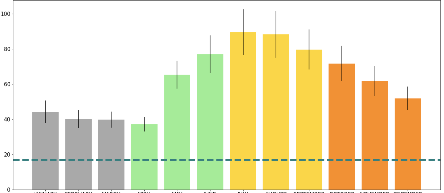
You can also change other setting of the line. For example, the colour of the line (color = ''), style (linestyle = ''), and the thickness of the line (linewidth = ):
plt.axhline(y=17, color='teal', linestyle ='dashed', linewidth = 5)
The same can be done using .axvline() function to make a vertical line using the x-axis.
Matplotlib has a lot of different arguments you can use to change how the plot is saved as an image. The two most useful ones I found - which I needed to use in order for my graphs to look good were: bbox_inches and facecolor.
bbox_inches was useful because it saves a given portion of the figure. Using the argument value 'tight' it makes sure that you don't have extra space around the figure.
facecolor is important if you have long names of axis titles which tend to go off the page - combined with the above it allows all your words to be put on the same colour background (using the argument value 'white' works best).
Example:
plt.savefig('/Path/plot_name.png', bbox_inches='tight', facecolor = 'white')
This library is most commonly used for working with vectors (i.e. DataFrames) usually in conjunction with Pandas.
To download, in the terminal enter:
pip install numpy
import numpy as np
Using NumPy’s .where() function, you can compare two columns from a dataframe. If the condition is met, then it will return true for the row, if it is not, then it will return false:
np.where(df['HIGHEST_MONTHLY_TOTAL']==df['Highest_Monthly_Value_check'], True, False)

This way it is very easy to see if you have any that are different, but overall I would recommend creating a new column in your DataFrame, so that you may see which rows are True/False.
In order to make the double bar graph spacing equivalent, NumPy’s .arange() can be used. It allows the user to return evenly space intervals based on the size inputted:
spaced_range = np.arange(12)
set_width = 0.4
plt.bar(spaced_range, df['Monthly_Mean'], width = set_width)
plt.xticks(spaced_range + set_width/2, df['Month'])
Pandas is a library in python that has functionality for data manipulation and analysis. It allows us to organize lists and store them as DataFrames. DataFrames are data structures which have labeled rows and columns. We want to create these dataframes to then be able to edit, manipulate, and analyze the data in a clear way.
To download, in the terminal enter:
pip install pandas
import pandas as pd
Rank is best used when you want the standings of a data set without changing the actual data set itself. I also found it useful when I wanted to compare more than one ranking within a data set.
Given a dataframe df you can add a column that uses the .rank() function and adds the particular rank of the column/row you want to rank. By default, the ranking is comparing indices (rows). If you want to compare the data columns-wise, you must specify axis = 1. Also by default, the ranking is given in ascending order.
In my data set, I wanted to have a ranking of my calculated monthly mean for each location (row) and I wanted to store it to be able to access it throughout my analysis. So I added a column called 'Mean_Monthly_Rnk' - you can do this by specifying the dataframe and using [ ] to access the dataframe:
df['Mean_Monthly_Rnk']=
df['Mean_Active_Months'].rank(ascending=False)
Sort Values is best used when you can/want to manipulate your dataframe to be sorted into the ranking order.
First, you must specify which column (or row) you would like to sort by axis = 0 is default (specify axis = 1 if using row to sort). As with rank, ascending is set to True by default
I did not want to change my initial dataframe, so I made a new dataframe to change the sorted data:
sorted_highest_monthly_df = df.sort_values('Highest_Monthly_Value_check', axis=0, ascending = False)
To add rows, Pandas has .append(). To add a column, Pandas has .insert().
For example, I wanted to combine two dataframes together. The dataframes had the same format: a list of locations (rows) and a list of months (columns) with number of violations for each location in each month.
First thing I wanted to do was create a new column in my individual dataframes which specified the year these violations were counted. I was able to do this using .insert(), where I was able to specify that I wanted the new column as the very first column of my dataframe. To use .insert(), first specify the location of the column, then the title of the column, and then the information you want inserted:
twenty_df.insert(0,'Year','2020')
nineteen_df.insert(0, 'Year', '2019')
df = twenty_df.append(nineteen_df)
To delete columns or rows, Pandas has .drop().
For my example, I wanted to drop the columns with the first two months of the year:
df.drop(columns = ['JANUARY', 'FEBRUARY'])
df.drop(rows = [3,7])
If you want to display part of the dataframe based on a range of values, using .between() would be best.
I wanted to find intersections that had a certain range of violations for both the highest monthly value and for the monthly mean. Meaning, I wanted to find:
df[‘Highest_Monthly_Value’].between(100,150)
df[‘Monthly_Mean’].between(30,50)
df [ ( df[‘Highest_Monthly_Value’].between(100,150) ) & ( df[‘Monthly_Mean’].between(30,50) ) ]
[['INTERSECTION', ‘Highest_Monthly_Value’, ‘Monthly_Mean’]]
df[(df[‘Highest_Monthly_Value’].between(100,150) ) & df[‘Monthly_Mean’].between(30,50))][['INTERSECTION', ‘Highest_Monthly_Value’, ‘Monthly_Mean’]]
There are many reasons why one might want to analyze true/false results. In my case, I received a dataframe with a column that had given the ‘HIGHEST_MONTHLY_TOTAL’. However, I wanted to be sure that this was calculated correctly. So I made a new column ‘Calculated_Highest_Monthly_Value’ and then I wanted to check whether there were any indices that had different values between the two columns.
Two way to approaches to getting indices of interest based on true or false:
1) First, I made new column
df['Compare_Highest'] =
df['HIGHEST_MONTHLY_TOTAL']==df['Calculate_Highest_Monthly_Value']
From there I was able to check for ~ (false) within the dataframe column ‘Compare_Highest’:
df[~df['Compare_Highest']]
If I had wanted to check for true I would remove ~.
2) To access the same information, we can check for the two columns not being equal to each other:
df[df['HIGHEST_MONTHLY_TOTAL']!=df[‘Calculated_Highest_Monthly_Value']]
In this case, the second way is more efficient but there could be cases where you are already given a true/false column and want to sort for a specific result. In that case, the first method can be used.
Within Pandas DataFrames you can group your data based on repeating labels within a column but using .groupby().
A function must be used on the data in order for .groupby() to know how to combine the matching rows. For my example, I wanted the mean of the violations for all months, and I wanted the data grouped based on the location of the red light cameras (intersection):
group_by_intersection_direction = complete_df.groupby(['INTERSECTION'], axis=0).mean()
complete_df.groupby(['INTERSECTION','CAMERA_FACING'], axis=0).mean().reset_index()
It can be very useful to compare DataFrames if you know that there will be only a few changes in the data. This is when .compare() is good to use.
Initially I had started to do this to try to compare two dataframes for my locations, but there were a lot more differences and it would require a lot of work to look through all of them, so I decided it would be better to do a visual comparison (scatterplot).
In some circumstances it may be useful to set the index to any values you want.
DataFrame.set_index(keys, drop=True, append=False, inplace=False, verify_integrity=False)
You can insert a column in any location. You only have to specify using the loc=# parameter.
df.insert(loc = 0, column = 'col1', value = new_col)
You can set all cells with a specific value to null. I found this solution on Stack Overflow.
df.replace('N/A',np.NaN)
Sometimes it is very useful to change the layout of your dataframe, in particular if you need to graph the data.
In my case, I wanted to graph a bar graph that had grouped data (up to 5 bars). So the first thing I did was get rid of all the columns I did not need (using .drop()):
sort_by_intersection_trimmed = sort_by_intersection.drop(['TOTAL_VIOLATIONS','Calculated_Highest_Monthly_Value','CAMERA_INSTALL_YEAR','LATITUDE','LONGITUDE','X','Y','JANUARY', 'FEBRUARY','MARCH','APRIL','MAY','JUNE','JULY','AUGUST','SEPTEMBER','OCTOBER','NOVEMBER','DECEMBER','HIGHEST_MONTHLY_TOTAL', 'Null_Months','Active_Months','Mean_Monthly_Rnk','Highest_Monthly_Rnk','Total_Violations_Rnk'], axis=1)
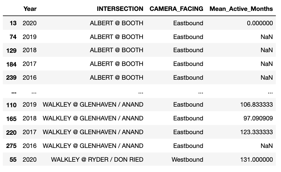
sort_by_intersection_table = sort_by_intersection_trimmed.pivot(index=['INTERSECTION','CAMERA_FACING'], columns='Year', values='Mean_Active_Months')

Pandas general math operations:
+ add()
- sub(), subtract()
* mul(), multiply()
/ truediv(), div(), divide()
// floordiv()
% mod()
** pow()
For my dataset I wanted to penalize all of the entries that had NaN (null value), so I decided to set all the null values to zero:
null_zero_df = df.fillna(0)
You can also count the number of nulls:
df.isnull().sum(axis=1)
Mean is very easy to calculate in pandas. All that is needed is the .mean() function.
Be sure to specify whether you want to calculate the mean of each column (axis=0; using each row’s values to calculate) or of each row (axis=1; using each column’s values to calculate). Also if you want to exclude all null values be sure to specify numeric_only=True:
monthly_avg = df.mean(axis=0, numeric_only=True)
df[[Columns_you_want]].std()
df[[Columns_you_want]].sem()
I wanted to take the standard deviation and standard error for only the data for the months. I wanted to store this data so I could later apply error bars to my bar graph. First, I made a DataFrame to store the information, with a STD and SE column. Then I used the reset_index() to move the months from the index and to their own column. The final step I did was change the new column formed “index” to a new name “Month”:
null_zero_stde_df = pd.DataFrame({
'STD' : null_zero_df[MONTH_COLUMNS].std(),}).reset_index().rename(columns={'index':'Month'})
'SE' : null_zero_df[MONTH_COLUMNS].sem(),
Pandas does have a function which calculates the correlation .corr(). It is very straightforward and allows you to just specify which correlation you would like to calculate. I wanted the Pearson r correlation for what I was doing so, I just had to specify which two columns I wanted to see a correlation for and specify the method=’pearson’:
group_by_intersection_direction[['Calculated_Highest_Monthly_Value','Mean_Active_Months']].corr(method='pearson')
SFU gave a good resource for correlation and scatter plots. So I tried using the SciPy package, which I actually preferred:
from scipy import stats
stats.pearsonr(df['Calculated_Highest_Monthly_Value'], df['Mean_Active_Months'])
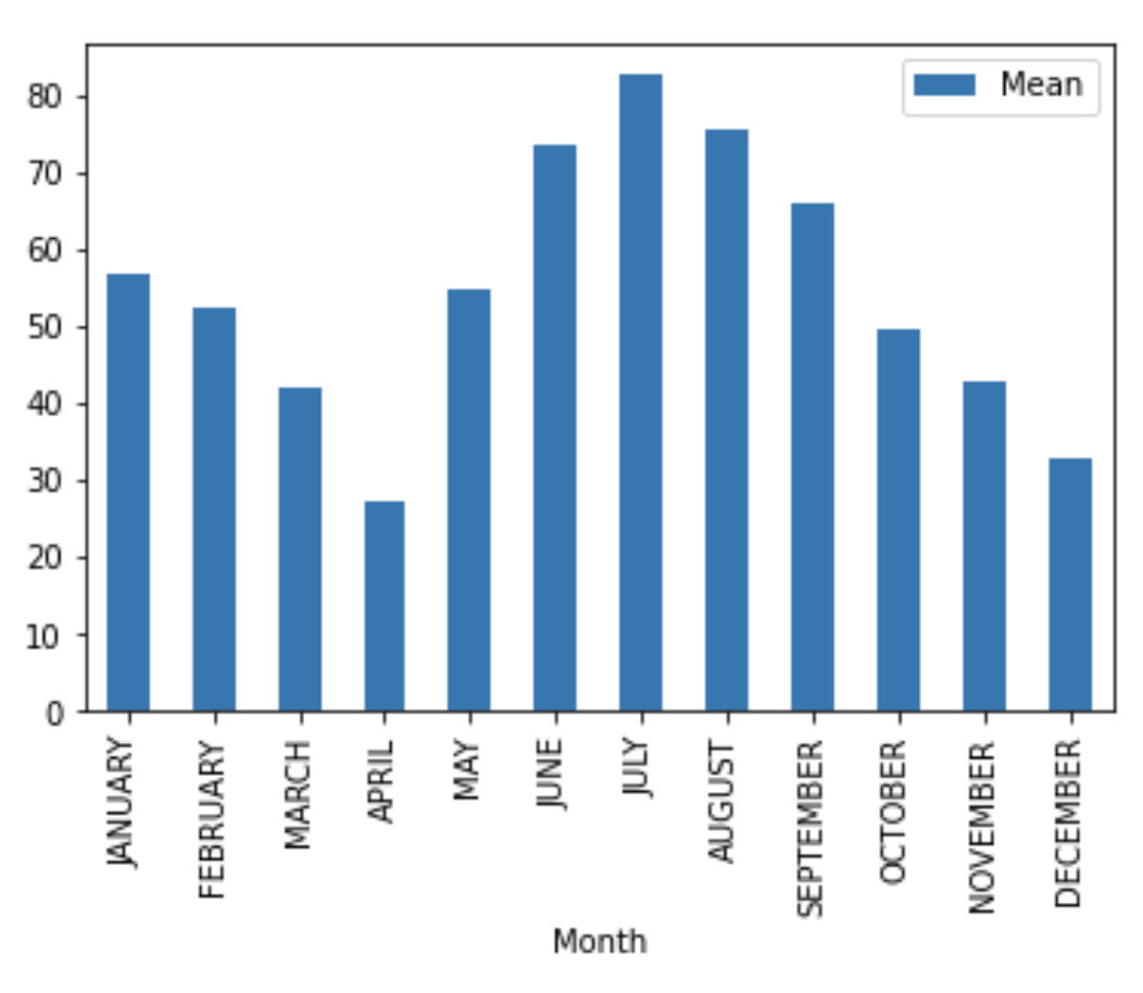
Pandas Bar Graph .plot.bar() does a great job plotting if you want a quick and easy bar graph. However, if you want to do more complex graphs, I would recommend using matplotlib.
Quick bar graph of months versus monthly mean:
monthly_mean_df.plot.bar(x='Month', y='Mean')
I wanted to include my dataframe in a table format on my website, so I found out that you can save the dataframe as an image.
First, you need to install the package: dataframe-image:
pip install dataframe-image
import dataframe_image as dfi
dfi.export(dataframe_name, 'dataframe.png')
Selenium is an open-source code initially written by Baiju Muthukadan. It allows you to send Python commands to the web. This means it will let you access the web from your Python program and let it automate things you normally would need to do yourself, such as tap on buttons, enter content in structures, check whether everything is okay with your site.
Selenium is mostly used as a testing package, however, I delved into using it to send commands to a webpage that needed a location to be entered before data could be taken. This is what I learnt:
There is a video I had watched that helped me a lot when walking me through how to set up Selenium. Here are the steps on how to set up Selenium on your computer.
First in the terminal, we need to install the module
pip install selenium
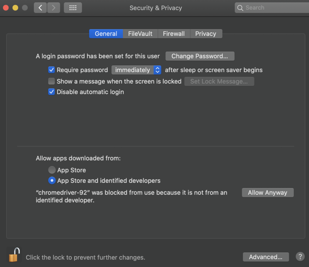
Next, you must install the correct webdriver: for using Firefox you need to install GeckoDriver and for using Chrome you need to install Chromium. Personally, I use Chrome (and MacOS Catalina has a known error with Firefox webdriver). For Chrome, I downloaded the correct version of Chromium - which at the time of writing this was version 92. You can check your version by:


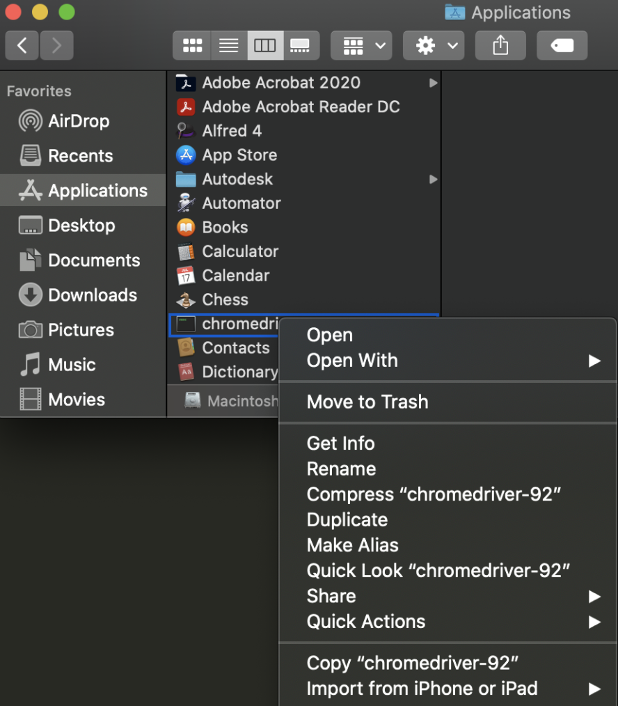
After you download the correct version of the webdriver, move it from your downloads folder into a separate folder (one that you will remember where it is located). Personally, I moved mine to the Applications folder, so the absolute path for my webdriver would be: “\Applications”. You can find the path on MacBook by doing these steps:
Once we have the location, we can start coding in our project.
Like always, we have to import the module
import selenium
path = "/Applications/chromedriver-92"
Rather than import selenium at the start, we actually have to import a specific module - the webdriver:
path = "from selenium import webdriver"
url = "https://www.costco.ca/"
path = "/Applications/chromedriver-92"
driver = webdriver.Chrome(path)
Now that we have set up the driver, we are able to access and open a webpage by calling:
driver.get(url)


Don’t forget at the end of your code to close the browser. The two most common simple ways to close it is:
driver.close()
driver.quit()