
Thank you for visiting my website!
The very first thing I did was I decided what material I wanted on my website and about how I wanted it to look. Then I drew on a piece of paper a rough idea of what I wanted, along with my must haves for the template. I knew I wanted three tabs but two of those three tabs I wanted a drop down menu so people can select from them. From there, I looked at templates on free-css - other websites are okay too, I just found one I liked on here. The one I picked was based on having what I needed (drop down menus) and also had colours and text style I liked (you can always change it but based on the scope of this project, I wanted to simplify my life).
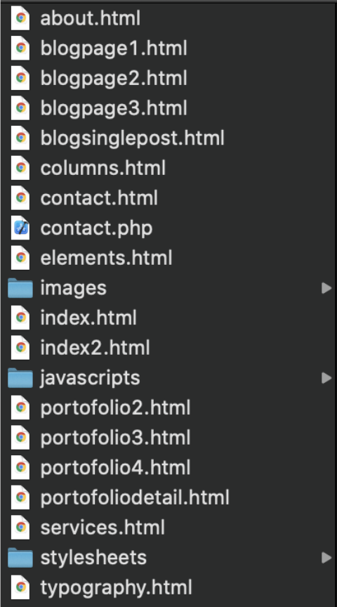
Once you have downloaded the template, there will be a lot of folders. You want to focus on the files that have .html at the end. If you try to open by double clicking the file, it will mostly likely open the webpage in a browser. If you want to edit the code, you can right-click and click open with "your text editor/IDE".
Right away I wanted to only keep three headers instead of six, with the following dropdowns (this will of course change as I continue to expand the projects I’m doing and knowledge I’m gaining this):
Since there is a dropdown menu this means that we will have documents that we must reference. The way to reference a webpage location is
< a href=“name-of-file-you-want.html”>What you want to have the reference for < /a>
From there, I planned out what I wanted to say on each page. For each of the pages, I have text documents containing all of the information I wanted on the website. I drew out rough versions of each page and picked which page (from the template) most suited what I wanted the page to look like plus what I needed to modify from the existing webpage. This really helped keep me from getting overwhelmed because I could always look back to my original plan and see what exactly needed to be changed.
Here are the existing HTML pages I wanted to use for each of my landing pages, so I renamed all of them accordingly (will show the rename later in the header section):
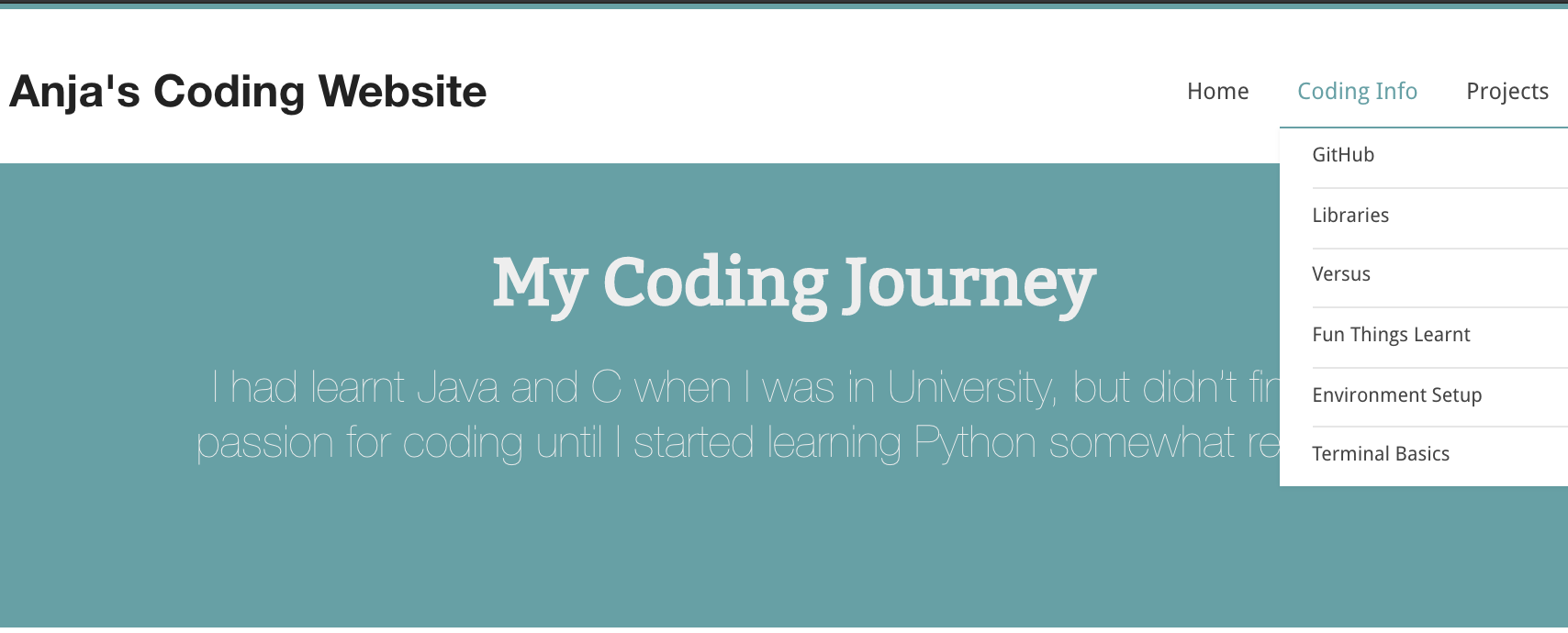
How my header looks like at the time of writing this:
Starting at the top of my index.html.
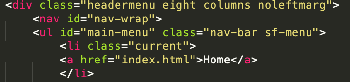
We have to look at the header that will appear at the top of each page to navigate from page to page (it is marked HEADER near the top of each html page).
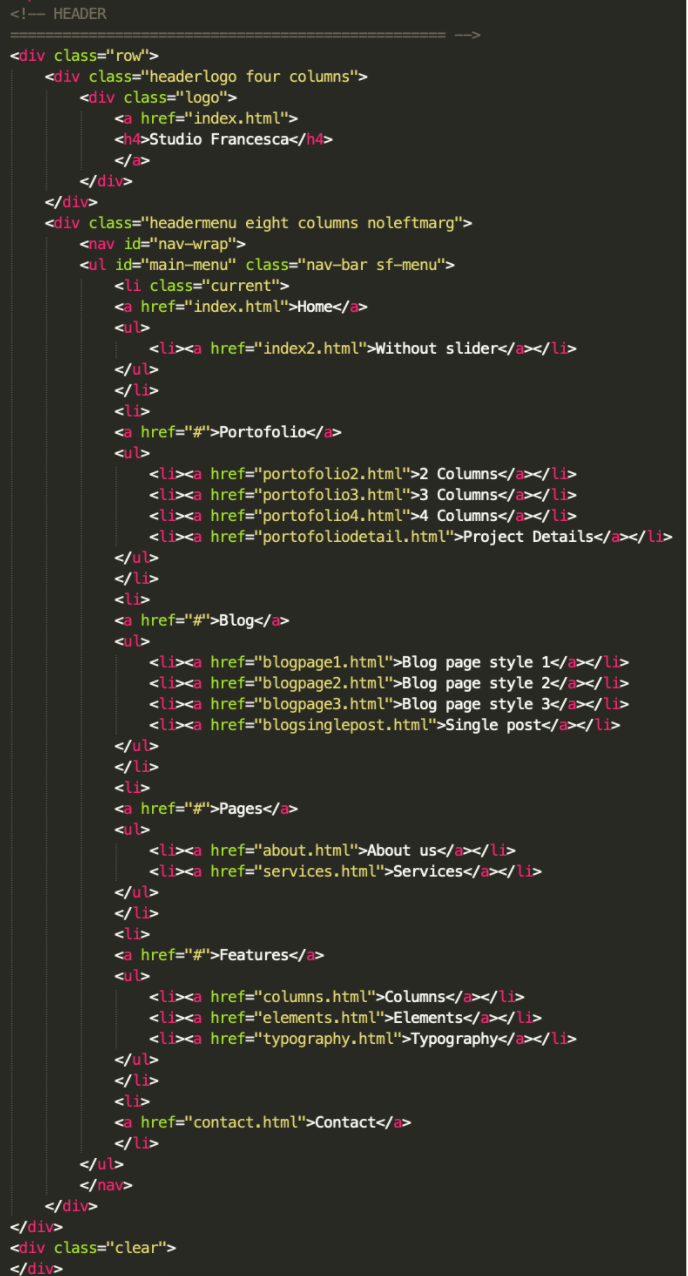
Like I mentioned above, I only wanted three categories, not six. So right away I only kept “Home”, “Portofolio”, and “Blog” and deleted the rest.
“Home”: I did not want the home page to have any dropdown menu, so I deleted the “Without slide” section. I also wanted the HTML name to be a bit more clear for me so I changed it from index2.html to index.html (side note - the home page must written as index.html, in order for the website to know what page to open first).
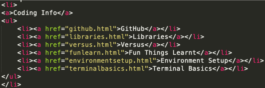
“Portofolio”: I wanted this section to be for my “Coding Info” and contain a dropdown menu with 6 options (I had to add two more: < li>< a href=" .html">< /a>< /li>). I then changed all the names and .html file names to better describe each page that I wanted. I also got rid of the “href” because I did not want to reference to any page for the Coding Info tab.
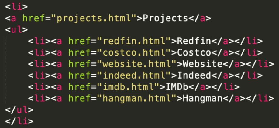
“Blog”: I wanted this section to be for my “Projects” and contain a dropdown menu with 6 options (as I did before). I also removed the href=”#” and put href=”projects.html” because I wanted to go to a landing page for the "Projects" tab.
It is important for this section to be the same for all HTML pages. So I copied the code from the top of the file until I hit:
< !-- SUBHEADER
================================================== -->
and I replaced the tops of the other files by pasting over top of the code that was there from the template. This way I could make sure that I had the same headers and website title for all the pages.
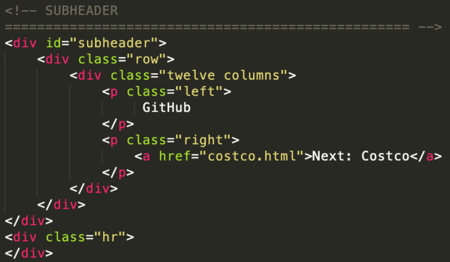
All my subheaders for the whole website will follow this format:
How my home page looks like at the time of writing this:

For the home page the layout I wanted was slightly different than the index2.html that was the template, but had the same basic idea.
I did not wanted to animated columns under the subheader, so I deleted the whole section labeled:
< !-- ANIMATED COLUMNS
================================================== -->
Then after the animated columns for the header, I wanted to have a paragraph text underneath. So I created a paragraph, and I selected the class="twelve columns”. This is because I looked at the HTML code for columns.html and saw which column style I wanted. In this case I wanted to have one column, which coincided with class=”twelve columns”. So my code looked like:
< div class="twelve columns">
< p>< /div>
< /p>
When typing paragraphs, if you want a break in the line but want to continue in the same paragraph section, you can type:
< br>
Next, I did not want three columns but rather two, so once again using the same method as before I found the class I wanted was class= "six columns". And within these columns I did not want a button that says learn more, but rather I wanted a list that has the various pages on my webpage with their links. So in order to find what types of code this specific template had for lists, I went to the topology.html code. The label of what I wanted was < ul class="disc">. So my code looked like this for both columns:
< div class="six columns">< h5>Coding Information< /h5>< /div>
< ul class="disc">< li>< a href="github.html">GitHub< /a> - description of page.< /li>< /ul>
< li>< a href=".html">< /a>< /li>
< li>< a href=".html">< /a>< /li>
I didn't need a section on testimonials or clients, so I changed it to an "About Me" section. I looked through the template pages to see if there was a style I liked and I found on the feature -> elements page there was a panel that I liked. So I deleted the carousel of clients, added the panel (taking up two thirds of the row) and added a picture to the right of the text (a third of the row).
< img src="" width="" height=”auto” alt="">
< center>< img src="" width="" height=”auto” alt="">< /center>
< div class="row">< div class="eight columns">< /div>< div class="panel">< /div>< h5 class="left">Anja Wu< /div>
< p class="clear authortext">
< /p>
< div class="four columns">< img src="" width = "300" height = "auto" alt="">< /div>
How my GitHub page looks like at the time of writing this:
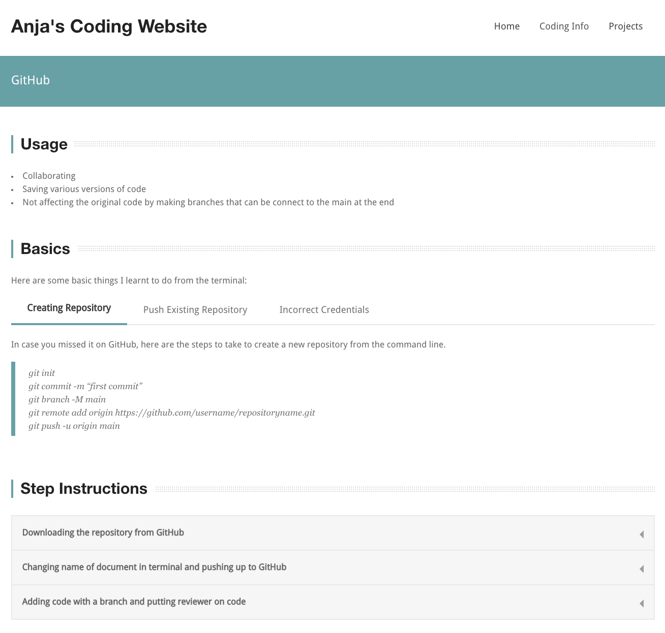
My GitHub description page has three main sections and I wanted all three sections to take up a full page:
< div class="twelve columns">
Each of the sections had the class="sectiontitle" and the h4:
< div class="sectiontitle">< h4>Usage< /h4>< /div>
Within "Usage" section I just wanted an unordered list as I didn't have much written. Under the topography.html you can find which type of bullet point you want, I selected the first one, so my < ul> (unordered list) class was "disc":
< ul class="disc">< li>item< /li> < li>item< /li>< /ul>
Within the "Basics" section, I liked the tabs that were there, so I kept them and only changed the label. Below you can find the information put into each tab. For the code sections, I decided to use the “testimonials” id formatting:
< div id="testimonials">< blockquote>Code< /blockquote>< /div>
In the first tab, we need to make sure we are connecting it to the correct id. In this case, we want it to be connected to the tab with the id "simple1Tab". Plus we also want to make sure that the "active" class attribute is present because it means this table will automatically be open when the page loads:
< ul class="tabs-content">< li class="active" id="simple1Tab">< /ul>< p>< /li>Sample writing< /p>
< div id="testimonials">< blockquote>< /div>My code< /blockquote>
The second/third tab are very similar, you just would not need the class="active" attribute.
Also you can add formatting to your writing by using:
< b>bold< /b>
< i>italicized< /i>
< u>underlined< /u>
Within the last section “Step Instructions” I wanted to have a dropdown accordion for the information for each of the step-by-step instructions I've made so far. I went and found the code in the template elements.html file under the header "accordions".
My code:
< ul class="accordion">< li class="">
< div class="title">< b>Downloading the repository from GitHub< /b>< /div>
< div class="content" style="overflow: hidden; display: none; ">
< ol>< li>On GitHub: go to the repository: click the green button “Code”< /li>< /ol>
< li>Copy the HTTPS writing and in your local terminal type< /li>
How my libraries page looks like at the time of writing this:
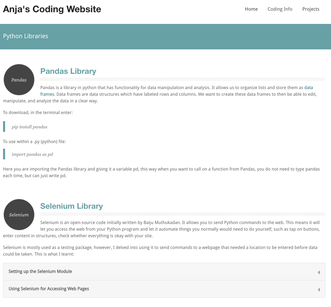
At the time of writing this I only had two libraries I had extensively used that were worth writing about, so I didn't need the pages section at the bottom. Plus I also did not need the right hand column, so I just deleted it. **Be very careful when deleting parts because you need to make sure you get the corresponding “/” tags! If you delete one < div> then you must also delete one < /div> in the correct spot.
For the Pandas section, I did not change very much from the original layout.
For the Selenium section, I wanted the accordion after description in order to not have to scroll a long time for two different headers . So directly after the last paragraph in the description, I added the class="accordion" like before:
< ul class="accordion">< li class="">
< div class="title">< b>Setting up the Selenium Module< /b>< /div>
< div class="content" style="overflow: hidden; display: none; ">
< p>My stuff< /p>
...
Part way through I wanted to make an ordered list that was indented so as to show it is a subsection. But in order to do this I actually had to go to a different file. Since inserting a tab is considered "style", we need to go to the style.css file. This file is a very long file that has all the design details of the website. I made a new section, that I put a commented out section with my name, so I could easily find any style things I add in case I want to change them. In this .CSS file, I added the following code:
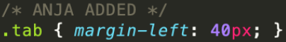
Now that we have made that adjustment in the style.css, we can go back to the file we were working on. In order, to call the "tab" style, we will put class="tab" in the div container.
< div class="tab">< ol>< /div>< li>< /li>< /ol>
How my versus page looks like at the time of writing this:
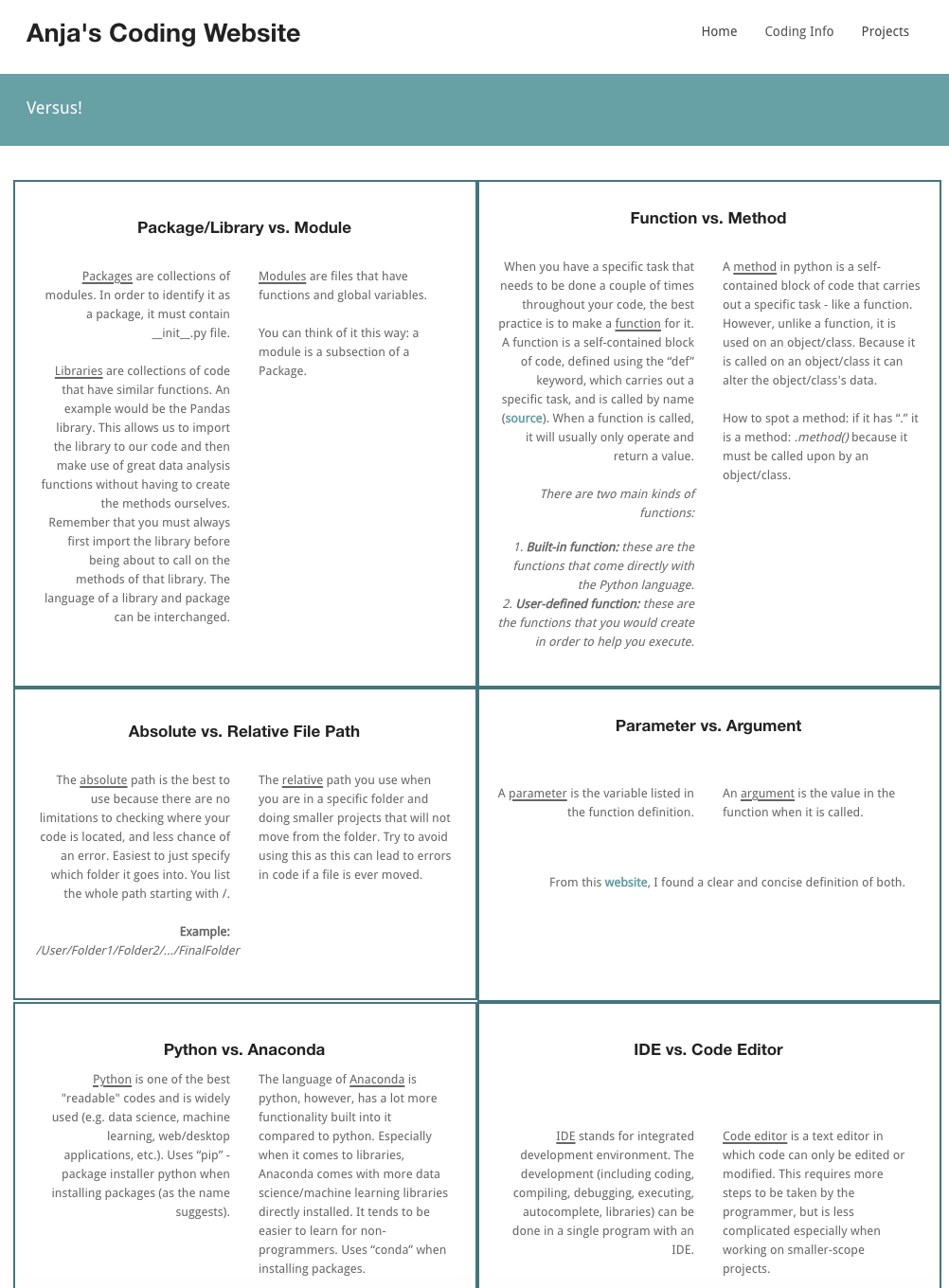
I removed the tags: " twoportofolio category trains" because I didn’t need to classify any category.
Since I wanted a border that was not part of the style code, I went back to the style.css and added the following code:

I then went back to my HTML page and added the class "columnborder" to each of my columns. I also had to add the padding style to here because I wanted it different for each box to make the edges line up (I ranged it from 1.35 to 2em).
< div class="six columns columnborder" style="padding: 1.35em;">
I also centred the headings for each box by using < center>:
< h5>< center>< b>Package/Library vs. Module< /b>< /center>< /h5>
Next, in each box I wanted to have two columns to compare the two things I was looking for. So within the row class, I added for the first definition:
< div class="six column">< p align="right">< /div>
< /p>
< div class="six column">< p align="left">< /div>
< /p>
After I had styled two of them how I wanted, I copied and pasted that code two more times to get a total of 3 rows and 6 boxes.
How my fun things learnt page looks like at the time of writing this:
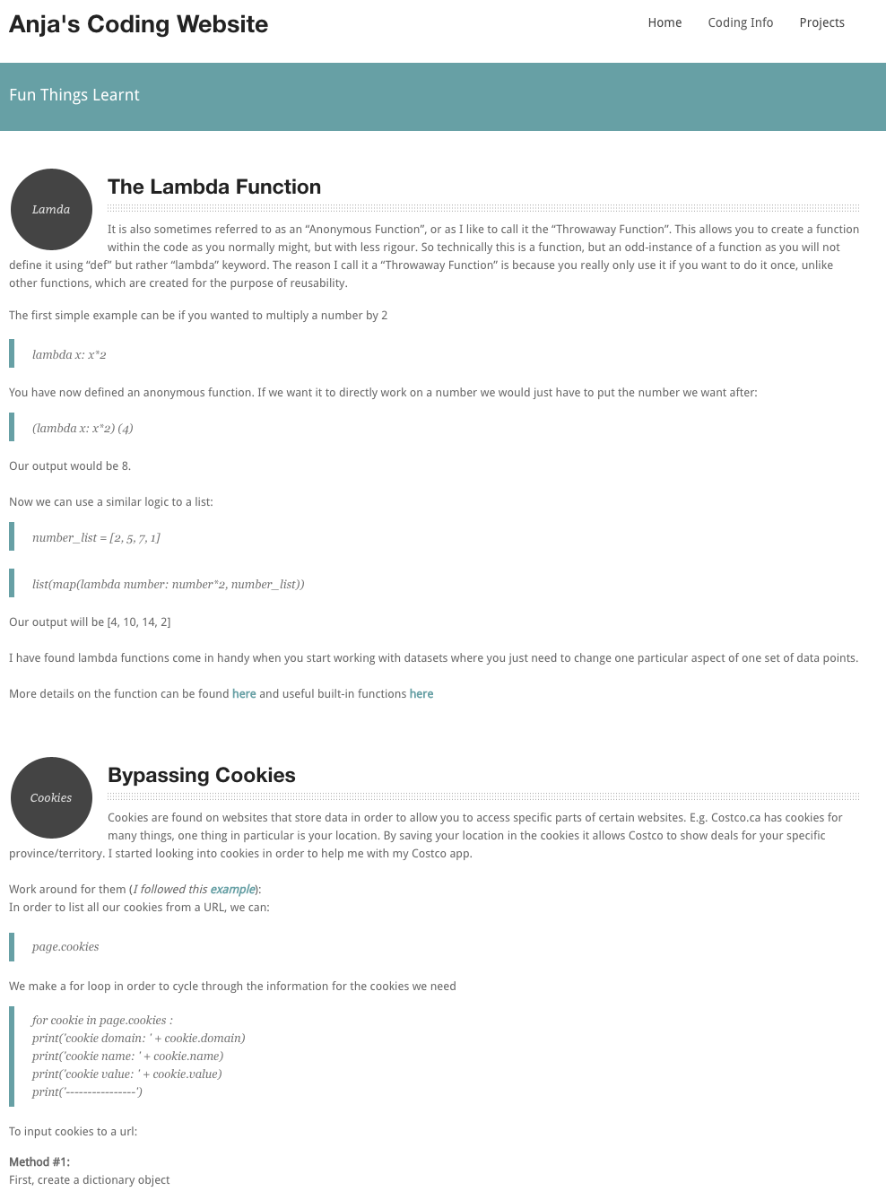
I applied the similar process to what I did with the libraries page!
How my environment setup page looks like at the time of writing this:
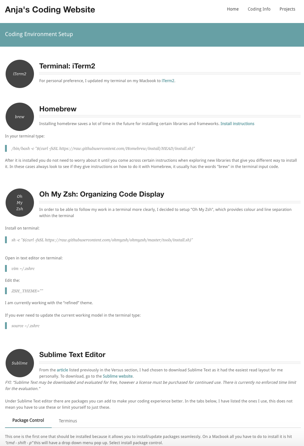
I applied the similar process to what I did with the libraries page!
How my terminal basics page looks like at the time of writing this:
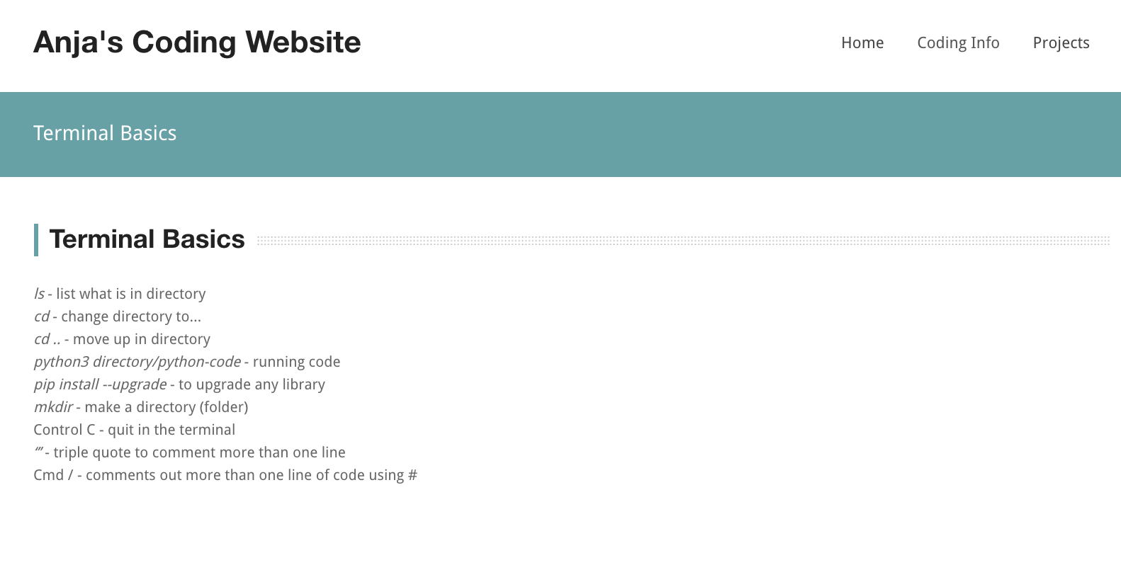
I applied the similar process to what I did with the GitHub page, but left out the accordions!
How my projects landing page looks like at the time of writing this:
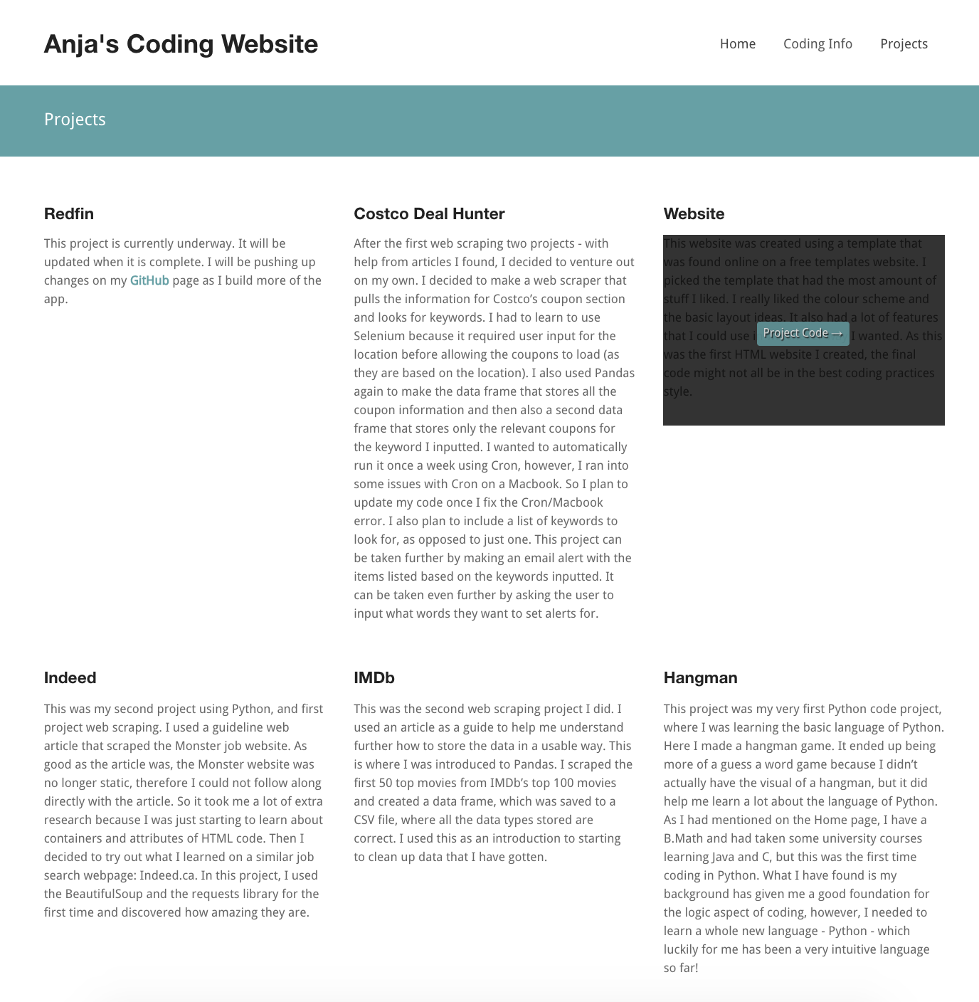
For the Projects landing page, I kept the layout very similar to what they had. I did not want a picture but I did want when someone hovers over the project for it to have a shadow background with the option to bring you to the project. So what I did was 1st, I deleted the portfolio id because I didn't need it:
< div id="portofolio">
< div class="row">
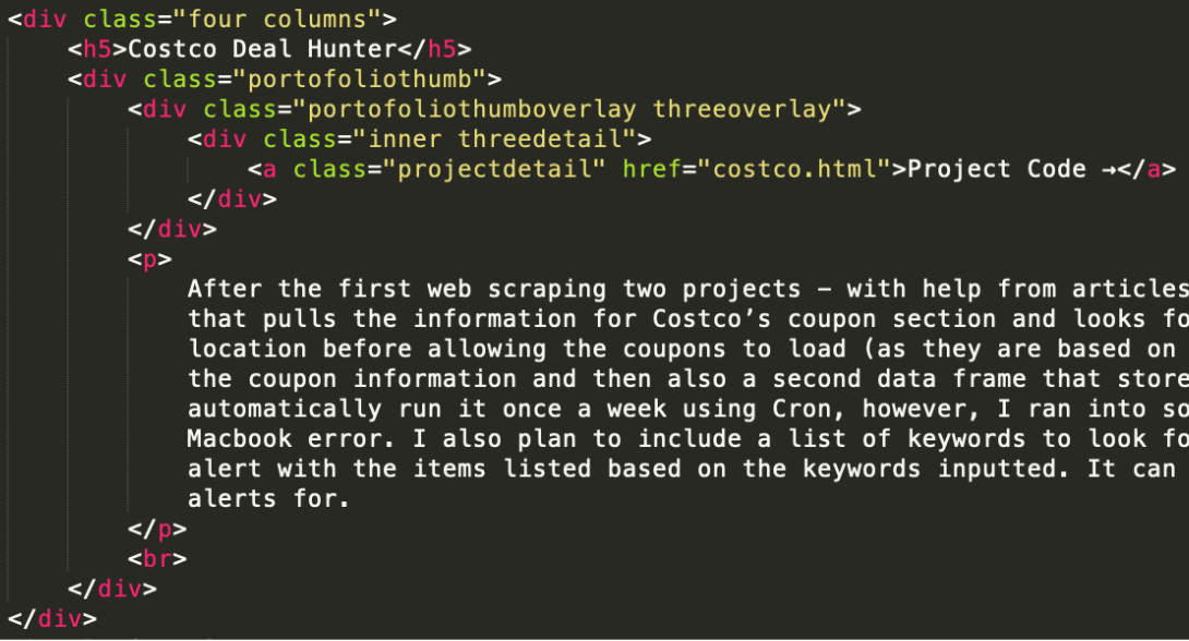
Now for each project box themselves:
The class attribute used to be similar to: "four columns threeportofolio category nature castles" but I only wanted to keep the four columns, I didn't need the rest (because I wasn't creating any categories). After the box header I deleted the paragraph. The shadow that appears on top of the picture comes from this code:
< div class="portofoliothumb">< div class="portofoliothumboverlay threeoverlay">< /div>< div class="viewgallery threegallery">< /div>< a data-gal="prettyPhoto[gallery]" href="http://www.wowthemes.net/demo/studiofrancesca/images/temp/folio4.jpg">< img src="http://www.wowthemes.net/demo/studiofrancesca/images/playgal.png" class="left galleryicon" alt=""> Gallery< /a>< /div>
< div class="inner threedetail">< a class="projectdetail" href="portofoliodetail.html">+ Project Details< /a>< /div>
< img src="http://www.wowthemes.net/demo/studiofrancesca/images/temp/folio4.jpg" class="threeimage" alt=""/>
Breaking it down further...
Here we get the grey shadow box:
< div class="portofoliothumb">< div class="portofoliothumboverlay threeoverlay">
< div class="viewgallery threegallery">< a data-gal="prettyPhoto[gallery]" href="http://www.wowthemes.net/demo/studiofrancesca/images/temp/folio4.jpg">< img src="http://www.wowthemes.net/demo/studiofrancesca/images/playgal.png" class="left galleryicon" alt=""> Gallery< /a>< /div>
< div class="inner threedetail">
< /div>< a class="projectdetail" href="portofoliodetail.html">+ Project Details< /a>< /div>
< /div>< img src="http://www.wowthemes.net/demo/studiofrancesca/images/temp/folio4.jpg" class="threeimage" alt=""/>< /div>
My final code for one of the project description boxes looked like:
How my hangman page looks like at the time of writing this:
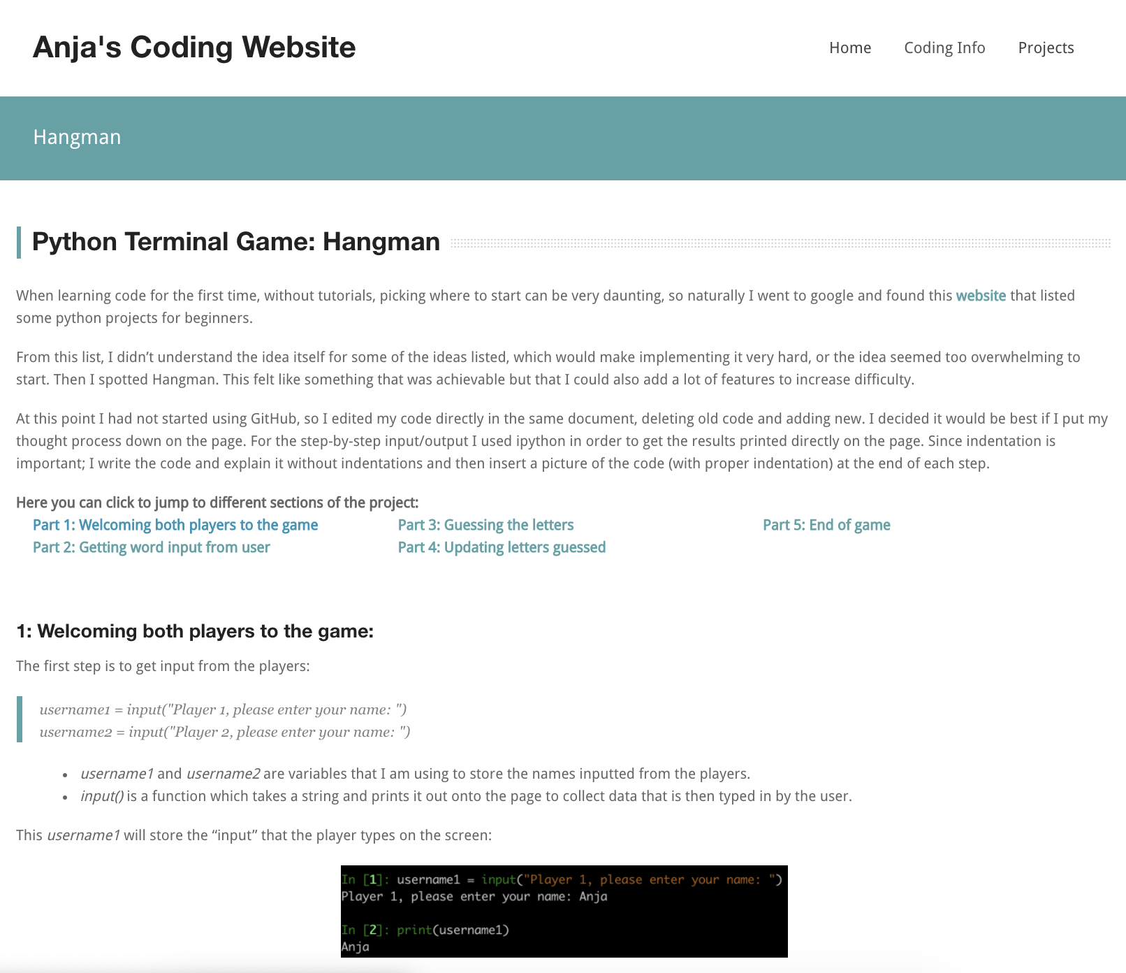
All of the projects had the same layout as a starting point. I started with the singleblog.html template.
The individual projects subheader is different from all other pages.
Then I deleted everything else other than the title and the main paragraph for posting.
Using the hangman webpage as an example
I was able to create a table of context at the top of my page and able to allow users to click a section of part to bring them to that section by:
First, putting id's on the section titles (I labelled mine based on which part it is):


The rest of the project is basic typing out my project - with formating I have already gone through.
How my footer looks like at the time of writing this:
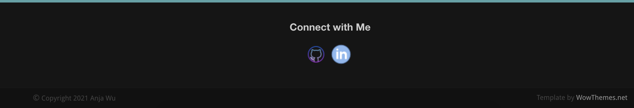
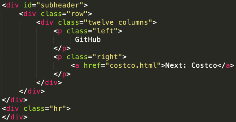
For the footer, I removed most of the stuff they had because I didn't need a lot of it and did not want to link to the social media listed. I only wanted the footer to have two social media platforms, GitHub and LinkedIn, and I wanted them in the middle of the row, so I changed the class to "twelve columns" and I centered it:
< center> < div class="twelve columns">< h1>Connect with Me< /h1>
...
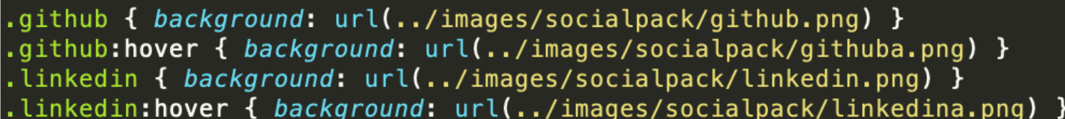
First, I went to the style.css to see how the template had done the social media icons. I found out the size of the icons the template currently had, by going into the images/socialpack directory and checking the size of the file. The images were 32x32 pixels.
Then found the icons I wanted on a website and made sure I specified the correct size. After I had downloaded the four images (two per icon to have a change in colour when hovering over the icon), I made sure I put them in the correct directory. Then I copied the code the template had in the style.css for the other social media icons and just replaced the class name and the image name:
...< /div> < /center>
< a class="social github" href="https://github.com/anjawu">< /a>
< a class="social linkedin" href="www.linkedin.com/in/anja-wu">< /a>