Here is the link to the GitHub code part of the assignment:
- "Anja_H1_Question_2_KNN_2Features.ipynb": has the analysis and selection of the "k" hyperparameter in the Iris database from sklearn focusing on just two features (the sepal ones) to predict classification of three species.
- "Anja_H1_Question_2_KNN_4Features.ipynb": has the above k-Nearest Neighbours analysis but done using all four features for the prediction of the species classification.
Highlights of Learning
Steps- Defining a data set from the Iris dataset
- Splitting training and test set
- Creating scatter plot to visualize
- Creating function that will print out the features from the integers in the dataset
- Creating Euclidean distance function
- Printing out nearest neighbours
- Create heatmap to analyze the training set distance from the test set distance
- Creating a line graph to show test accuracy based on k
-
Defining a data set from the Iris dataset (did 2 then 4 features):
Taking the first 2 features from the data matrix:Extending the matrix to all four features:X = iris.data[:, :2]
y = iris.target # The class labelsX = iris.data[:, :4]
y = iris.target -
Splitting training and test set:
We set 20% of the dataset as the test set, and 80% as the training setfrom sklearn.model_selection import train_test_split
X_train, X_test, y_train, y_test = train_test_split(X, y, test_size=0.2, random_state=42)
-
Creating scatter plot to visualize (two different sets):
For the first two features
Making a scatterplot for two features (sepal) and three species:Change the legend name of the class to be Iris species like Setosa, Versicolour, and Virginica:f, axs = plt.subplots(figsize=(8,6))
the_scatter = axs.scatter(X[:, 0], X[:, 1], c=y, cmap=plt.cm.Set1, edgecolor='k')lines, legend_names = the_scatter.legend_elements()
legend1 = axs.legend(lines, ['Setosa', 'Versicolour', 'Virginica'], title="Classes")
axs.add_artist(legend1)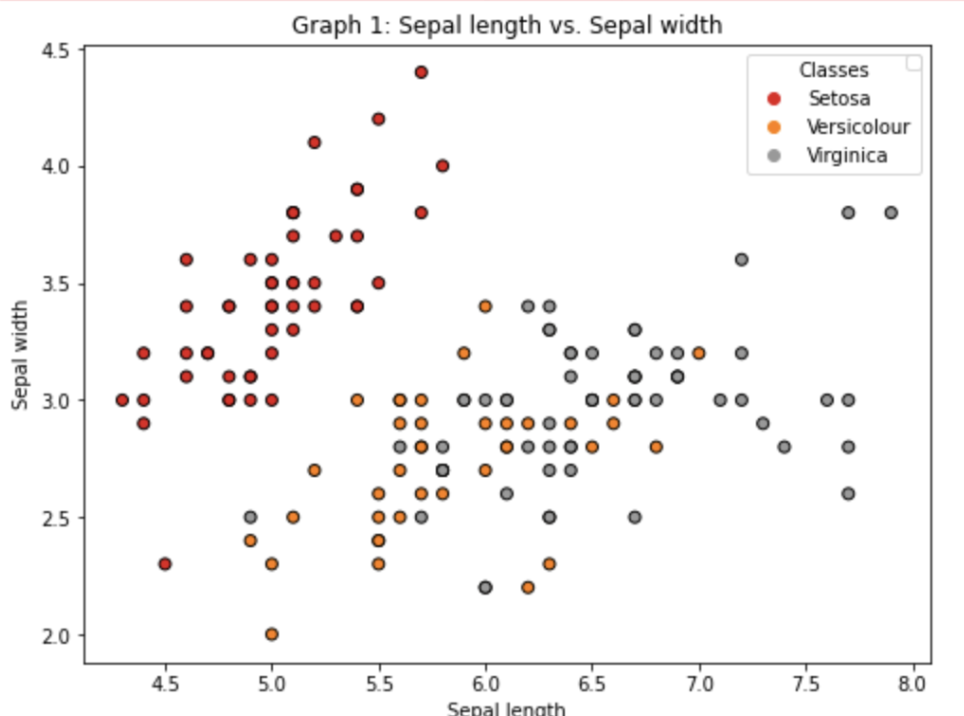
For the last two features
Making a scatterplot for two features (petal) and three species:f, axs = plt.subplots(figsize=(8,6))
the_scatter = axs.scatter(X[:, 2], X[:, 3], c=y, cmap=plt.cm.Set1, edgecolor='k')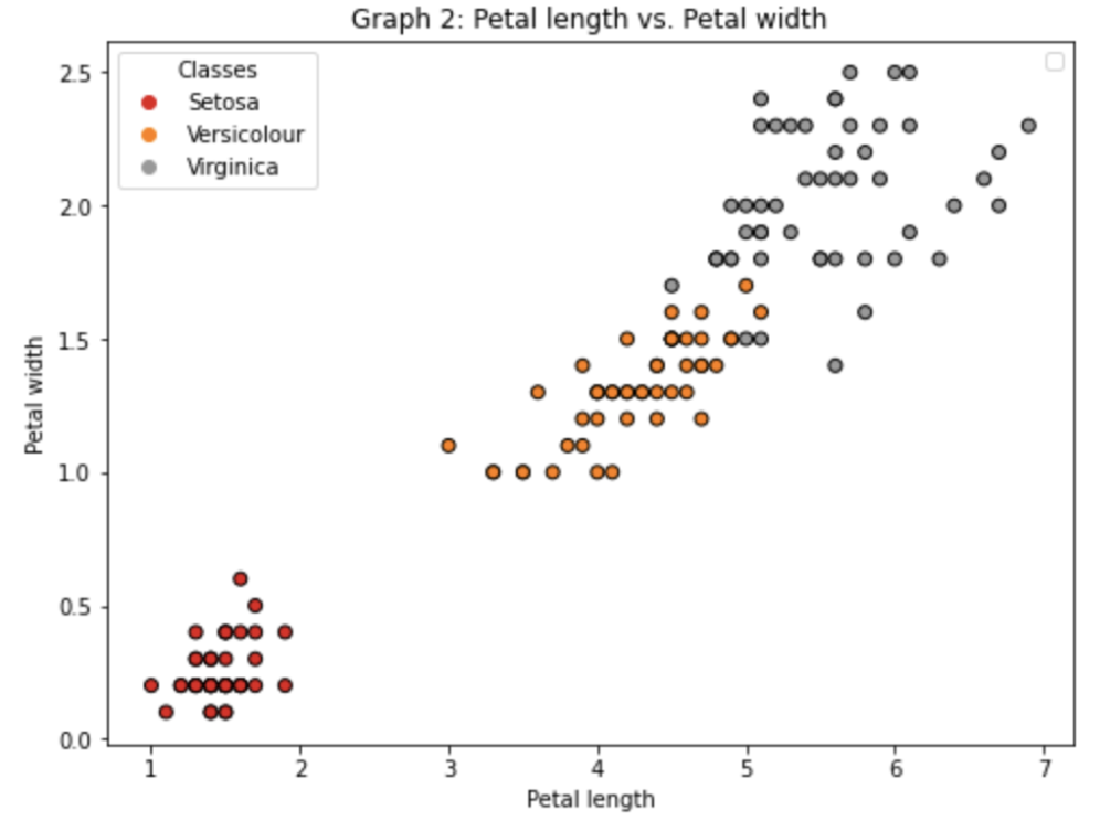
As can be seen two of the features (petal) give a lot more information in the boundary decisions. We would expect when we include them for our predictions to be done well. -
Creating function that will print out the features from the integers in the dataset:
Due to the fact that the categorical variables needed to be encoded, we must pull out the type in order for the values to be interpretable in our data. So we define a function print_features(x,y) that will print out the Iris type and sepal width/length, in a clean format.def print_features(x,y):
print('Iris type:', ['Setosa', 'Versicolour', 'Virginica'][y-1])
print('Sepal Length: %.1f \t Sepal Width: %.1f'%(x[0], x[1])) -
Creating Euclidean distance function:
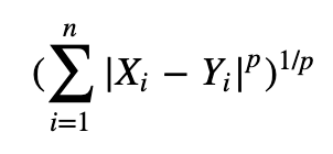
This was done for fun to check if the same neighbours would be returned as using the k-nearest neighbour function from sklearn (to further understand what was occuring "under the hood" for the algorithm.def euclidean_distance(x1, x2):
distance = sqrt(np.sum((x2-x1)**2))
return distance -
Printing out nearest neighbours:
Using my Euclidean distance formula
First, we randomly select a test example (#11) and print features so we can compare to the nearest neightbours:Next, we calculate the euclidean distance to this test example:sample = X_test[10]
print('Test Sample:')
print_features(sample, y_test[10])Finally, we print the closest 2 neighbours with their features for comparison:distances = []
for i, row in enumerate(X_train):distance = euclidean_distance(sample, row)distances.sort(key=lambda tup: tup[1]) # sorting distances
# print(f"{i}: {distance} from x1: {sample} and x2: {row}") # Checking calculations above for correctedness
distances.append((i, distance))k = 2 # Number of nearest neighbors
print('\nTop %d Nearest Neighbors:' % k)
for nn in range(k):print_features(X_train[distances[nn][0]], y_train[distances[nn][0]])
Using sklearn k-NN
Import function from library:Just like before, we select test example #11 and print features so we can compare to the nearest neightbours. Then we use the sklearn function KNeighborsClassifier() to specify looking at the top 5 neighbours:from sklearn.neighbors import KNeighborsClassifier
Finally, we print the closest 5 neighbours with their features for comparison:k=5
neigh = KNeighborsClassifier()
neigh.fit(X_train, y_train)
dists, neighbor_ids = neigh.kneighbors(X=[sample], n_neighbors = 5)print('\nClosest 5 neighbors to this test sample:')
for knn in range(5):print('\nNeighbor %d ===> distance:%f'%(knn, dists[0][knn]))
print_features(X_train[neighbor_ids[0][knn]], y_train[neighbor_ids[0][knn]])
From the results, both produced the same top 2 nearest neighbours. This makes sense because in reading the documentation for KNeighborsClassifier() the metric is technically Minkowski, but when p=2 (power parameter) it is equivalent to Euclidean metric. Since the default is p=2, we know that the calculations should be the same. -
Create heatmap to analyze the training set distance from the test set distance:
Creating list to store distances between the test set and the training setCreating a "colorbar" graph to display distance from each training example to each test exampledistances = []
for x_test in X_test:distance = np.sum((x_test[np.newaxis, ...] - X_train) ** 2, axis=1)
distances.append(distance)distances = np.array(distances)
plt.figure(figsize=(50, 20))
plt.imshow(distances)
plt.colorbar()
plt.xlabel('Training examples id', fontsize=40)
plt.ylabel('Test examples id', fontsize=40)
plt.xticks(np.arange(0, 120, 2), fontsize=20)
plt.yticks(np.arange(0, 30, 1), fontsize=20) plt.show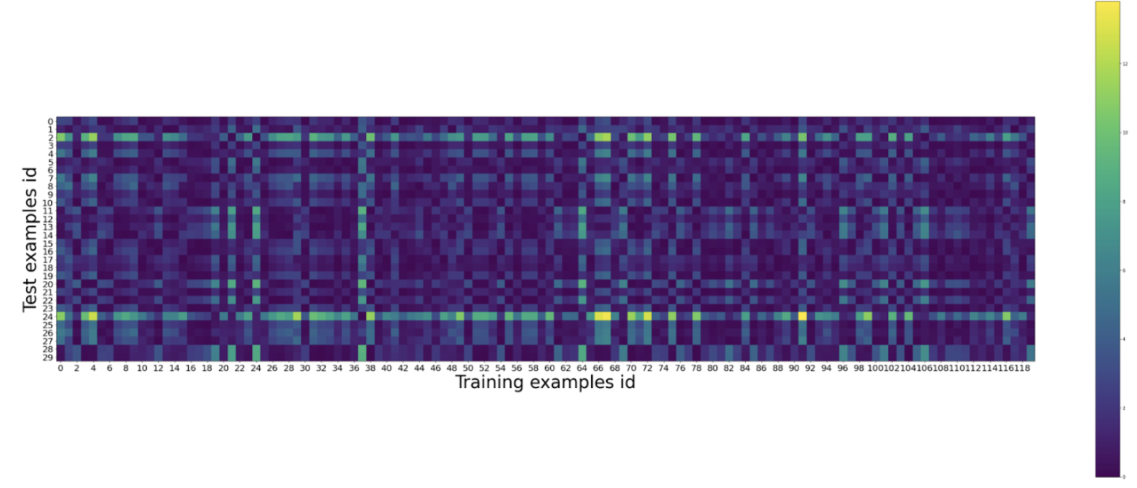
Note: a good reason to check this is because we want the distances between the sets to be small. This is when k-Nearest Neighbours works best. If the heatmap shows a lot more further distances, this means the sample was not done well. -
Creating a line graph to show test accuracy based on k:
Creating list of all test accuracies based on changes in kCreating a line graph to depict accuracy to be able to find the best hyperparameter (in this case, k value) visually:test_accs = []
for k in range(1, X_train.shape[0]):# Create K nearest neighbors classifier
neigh = KNeighborsClassifier(n_neighbors=k)
neigh.fit(X_train, y_train)
# Prediction
y_pred = neigh.predict(X_test)
# Calculate accuracy
acc = (y_pred == y_test).mean()
test_accs.append(acc)For 2 features:plt.figure(figsize=(30, 10))
plt.plot(list(range(1, X_train.shape[0])), test_accs)
plt.axhline(y=0.93, color='r', linestyle='-')
plt.axvline(x=29, color='b', linestyle='--')
plt.xlabel('Number of nearest neighbors (k)')
plt.ylabel('Test set accuracy')
plt.xticks(np.arange(0, 120, 2), fontsize=18)
plt.yticks(np.arange(0, 1.0, 0.05), fontsize=18)
plt.grid()
plt.show
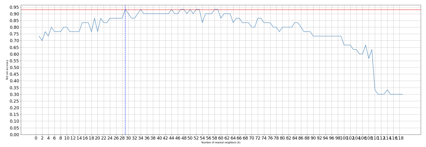
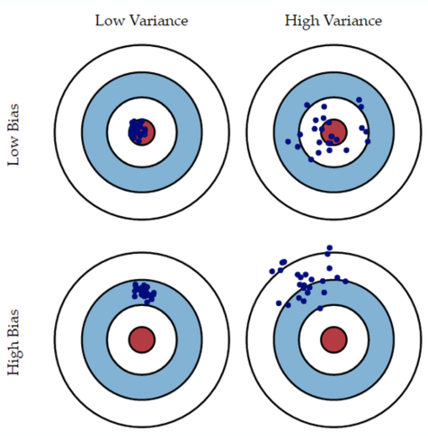
We can see the accuracy of the test set decreasing the larger k-values we have due to the fact that we are underfitting the model on the training set leading to a decrease in finding the underlying relationship. At a low level of k, we can see that the accuracy performs more poorly due to overfitting on the training model and capturing more noise than the underlying relationship.
For 4 features:

As can be seen the more features that are added the more accurate the predictions.
After this assignment we discussed the fact that the data should be divided into three sections: training set, validation set, and test set. This way the test set is only used once to check accuracy and the validation set is used to determine the best hyperparameters.

